the.round
Visual identity and web design for a payments community. the.round is where Yuno brings together leaders in payments, AI and tech for dinners, group experiences and socials in San Francisco and New York.
- Client
- Yuno
- Industry
- Payments
- Year
- 2026
- Role
- Graphic designer
- Deliverables
- Logo, visual system, imagery, landing page, motion, print and social
A community, not another event.
Yuno wanted a space where payments leaders meet away from conference stages. It had to feel like its own thing and still clearly belong to the Yuno family.
- 01Senior guests.
Heads of payments, founders and CTOs get invited to everything. The brand had to feel worth a night out.
- 02Not an ad.
If it looked like a Yuno campaign, nobody would come for the conversation.
- 03Three formats.
A dinner, a group activity and a social. One name, without turning into three brands.
- 04Two cities, one season.
Twelve dates between San Francisco and New York, all in one calendar.
Fewer people. Better conversations.
Every seat is confirmed by the team.
Small enough to talk to everyone.
San Francisco and New York, one season.
The family is there, never in front.
The name says it twice: a round is a group sitting in a circle, and a round is what you buy for the table.
A dot joins the circle.
The logo comes from three places. Everything else grows from them.
- 01One member, one dot.
Each person is a dot. The smallest piece of the brand.
- 02The dot in the name.
The dot between "the" and "round" is a person joining the circle.
- 03Many connections.
Dots come together and form the circle around the table.
- 04One color.
The logo and its dot always share the same color.
One mark, many places.
- 01It says the idea.
A circle of people, written into the name itself.
- 02Part of the family.
Dots and lettering come straight from Yuno's brand, without its logo on top.
- 03It names the formats.
the.table, the.experience and the.social use the same structure.
- 04It works small.
The dot alone is the avatar, the favicon and the stamp.
- 05It lives in one color.
White on night, night on mist, white on blue.
Every member is a dot.
The same dots rearrange themselves to draw each format. Some of them turn into photos of the people who were there.
Nine dots in a circle, one in the middle: a dinner for 15 people.
Dots in rows, like a group on a run or a hike.
Dots stacked like a toast, for drinks with 50 people.
Night, with one blue detail.
Yuno's blue is the accent. Everything else gets out of the way.
blue#3E4FE0 · RGB 62, 79, 224
Why blue?
- 01It is Yuno.
The one color that connects the community to the family.
- 02Used as a detail.
A glass, a jacket, a button. Never a blue flood.
- 03Night, not black.
A softer dark that feels like dinner, not a dashboard.
- 04Calm and confident.
For an audience that does not need to be shouted at.
Two weights, one voice.
Outfit for the brand, Geist for the details.
- LogoOutfit 300 + 700
- the.table
- HeadingOutfit 600 · −3%
- Build what comes next, together.
- LightOutfit 300
- Three ways to get together
- BodyGeist 400 · 16 to 18
- Trade notes on where payments is heading.
- LabelGeist 500 · uppercase
- San Francisco · Mar 10
The parts that build the page.
Warm, short and never salesy.
Save your seat now, details later.
Register now for an exclusive VIP experience!
This round’s on us.
Free drinks for all attendees!
One table, one question.
Join our panel of industry thought leaders.

Real gatherings that never look like stock: natural light, people in the middle of a conversation and always one blue detail.


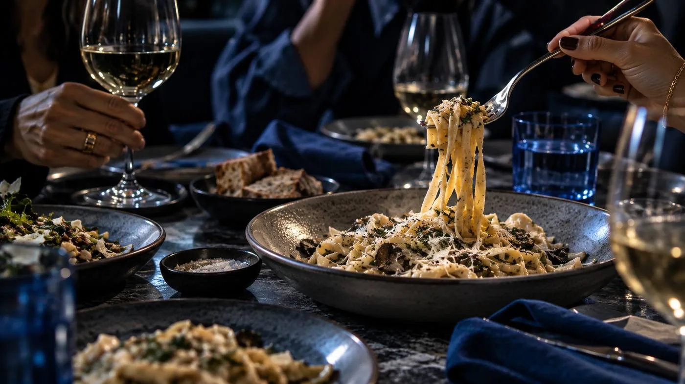
- Natural light
- People mid-conversation
- One blue detail
Stage and microphonesPosed handshakesBadges and lanyardsLogos on everything
A season calendar.
The page works like a calendar. Visitors filter by city and format, open each date as a card and save a seat before they know the full plan.
This is the real page. Scroll, filter and open a date.
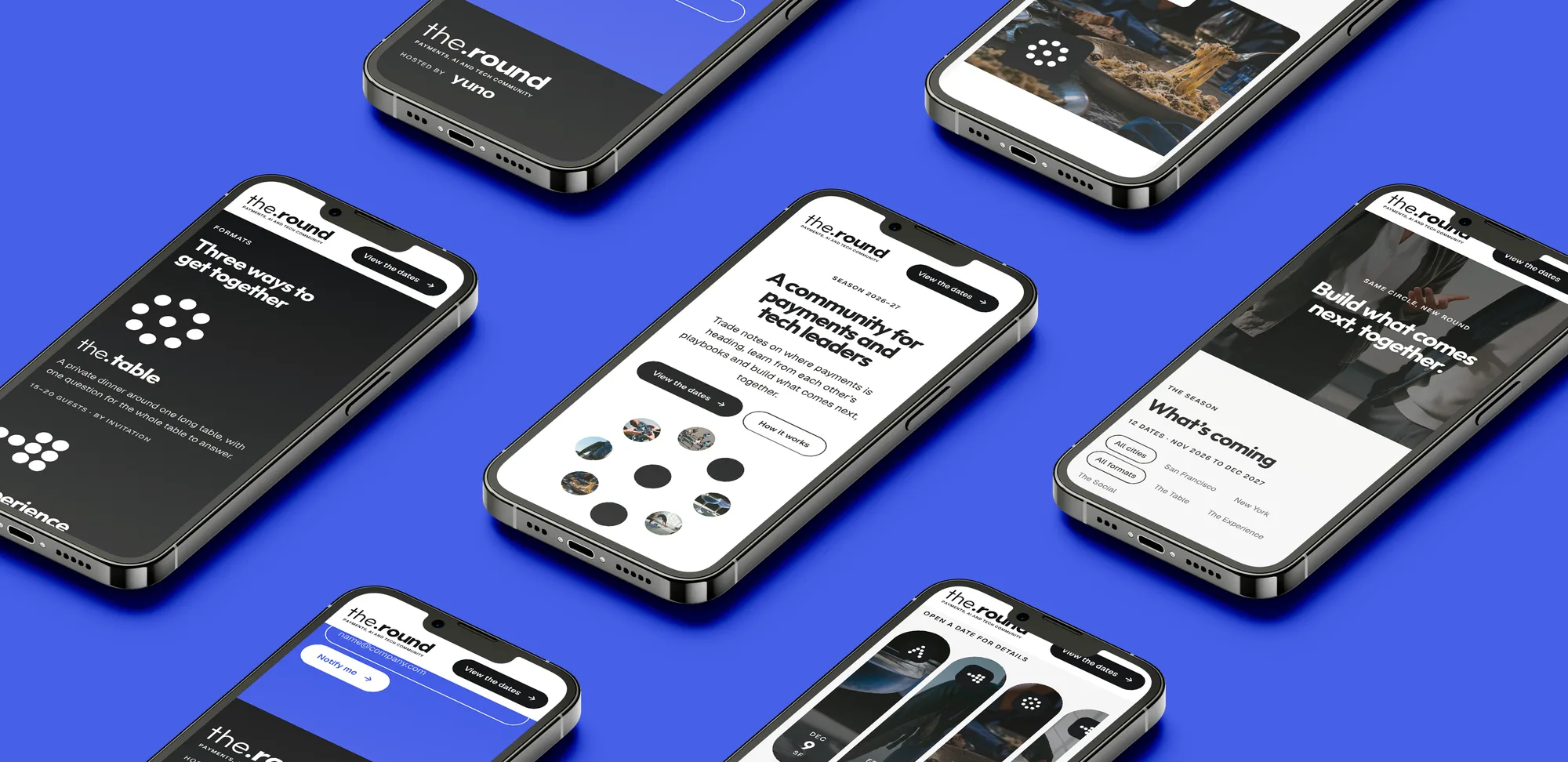
- 01It opens with people.
The hero dots turn into photos of the guests.
- 02Dates come first.
The whole season is visible in one row of cards.
- 03One click to a seat.
Short form, no account, details later.
- 04It moves softly.
Titles rise, photos zoom and dots regroup.
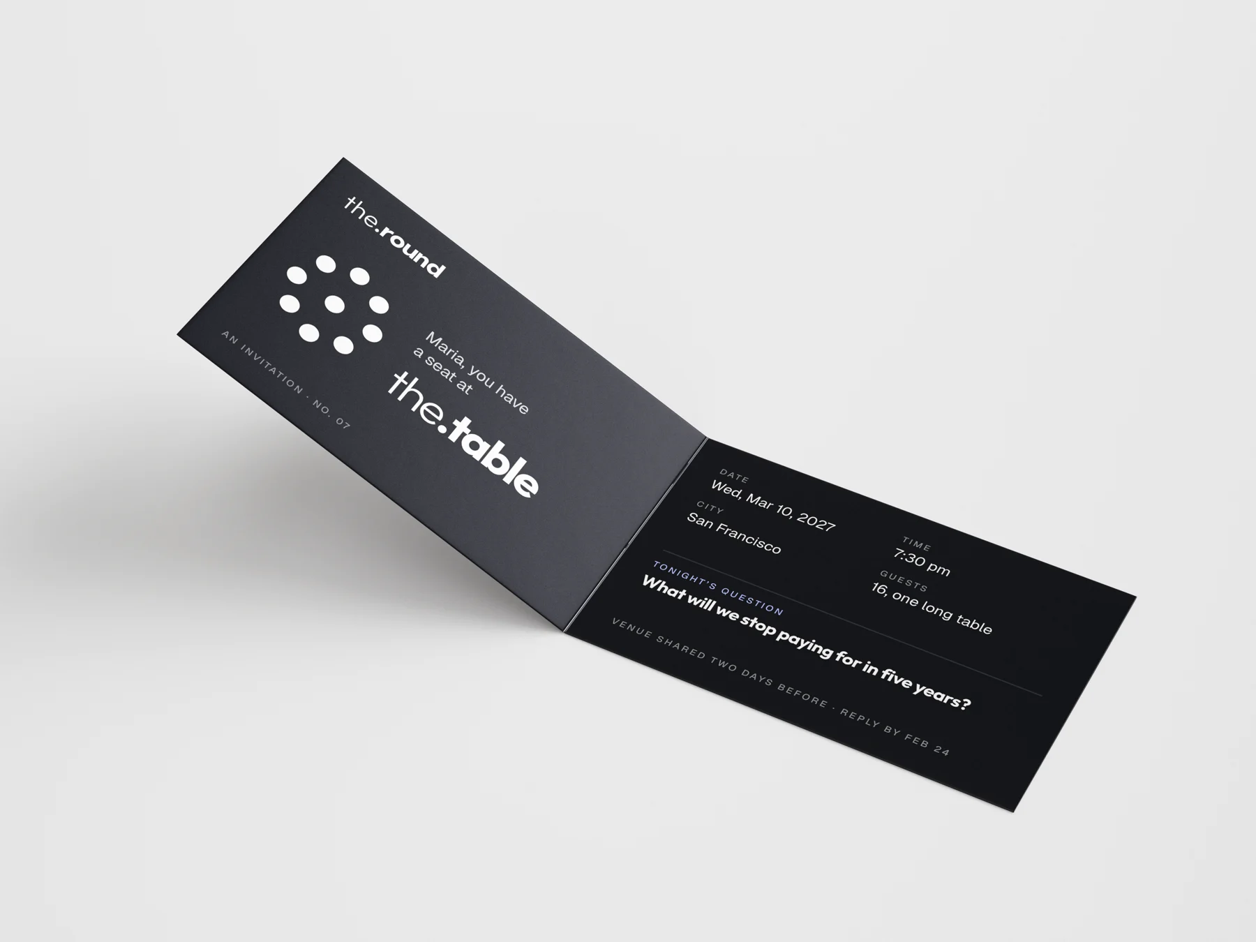
The brand in the room.
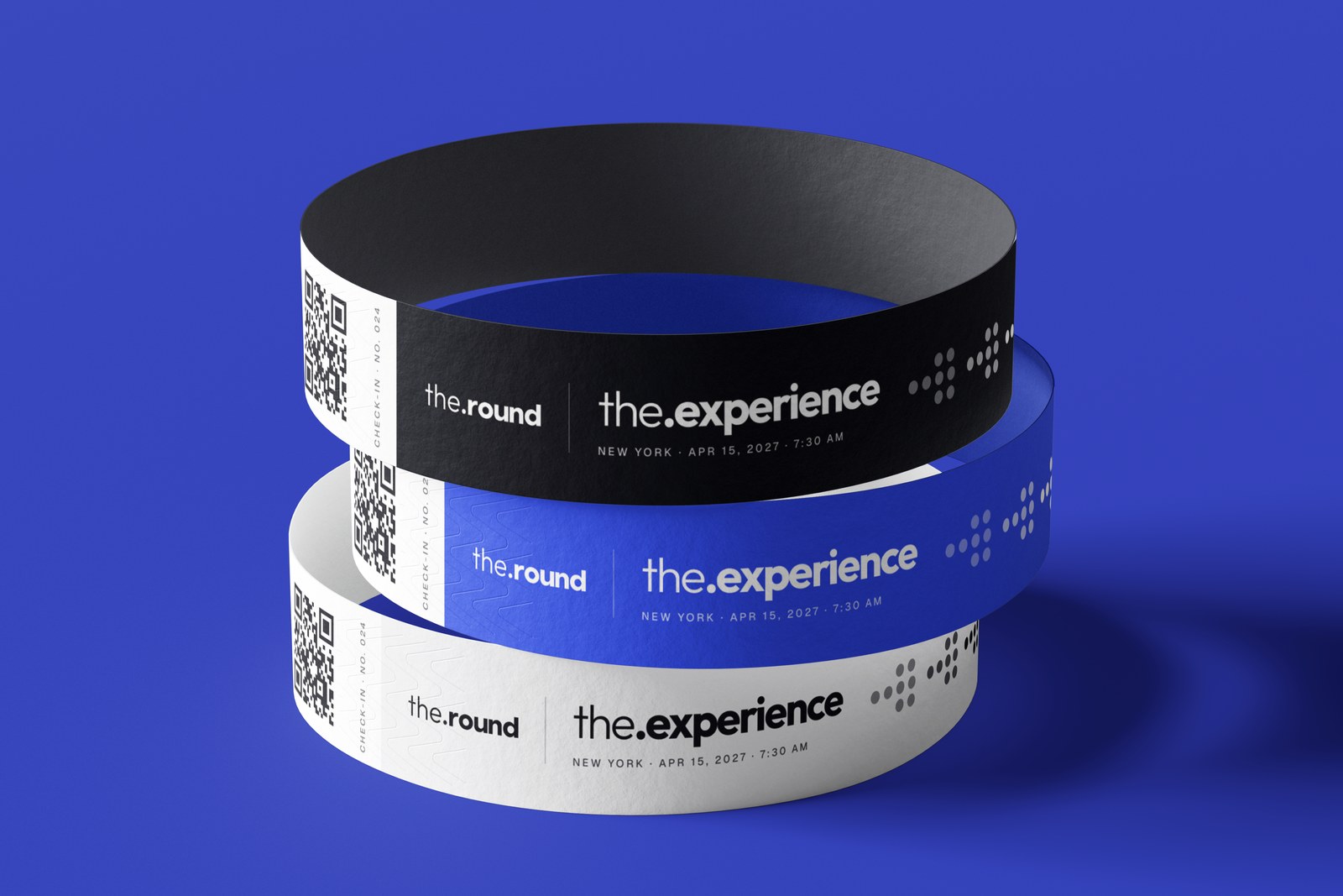
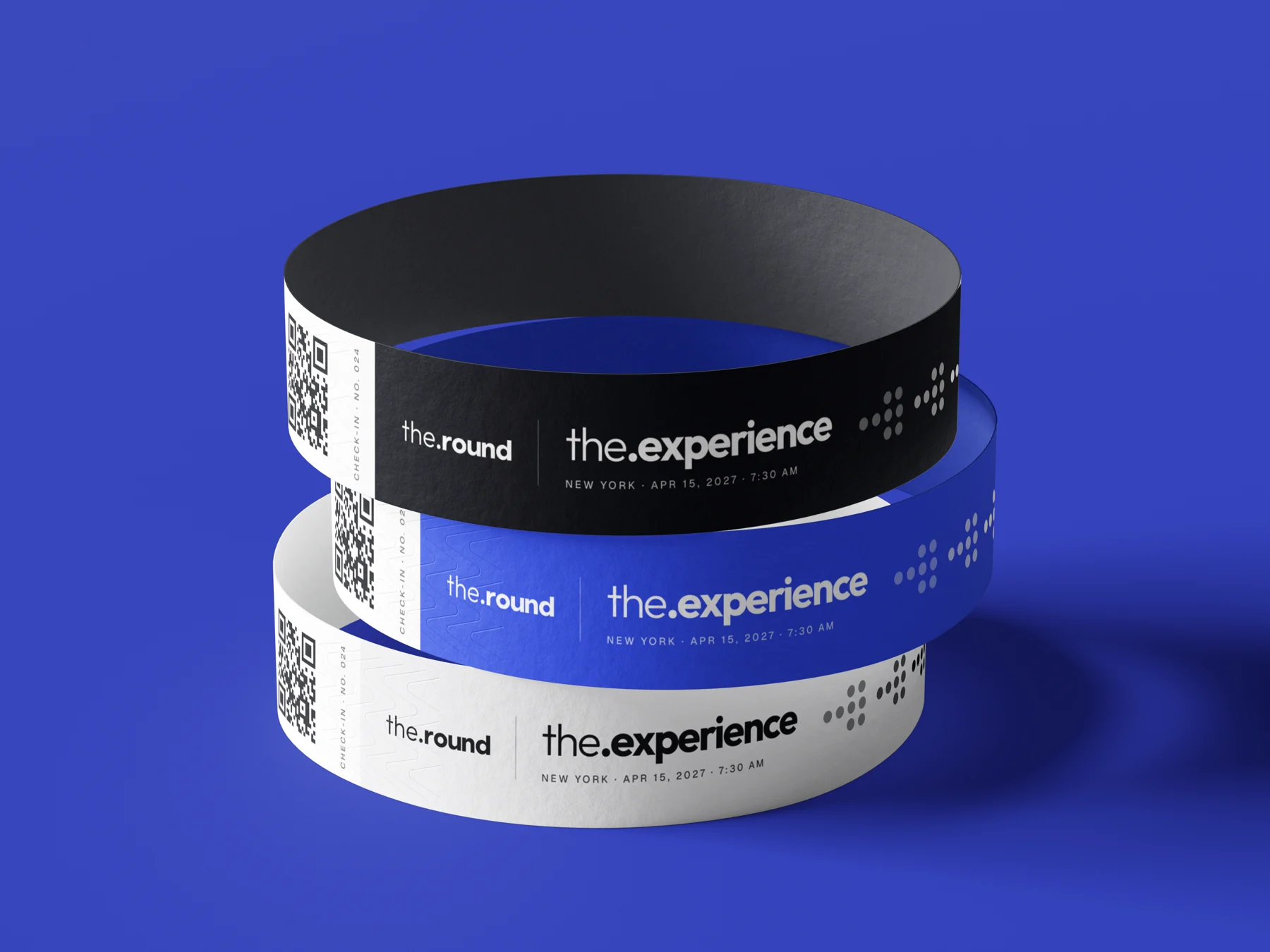
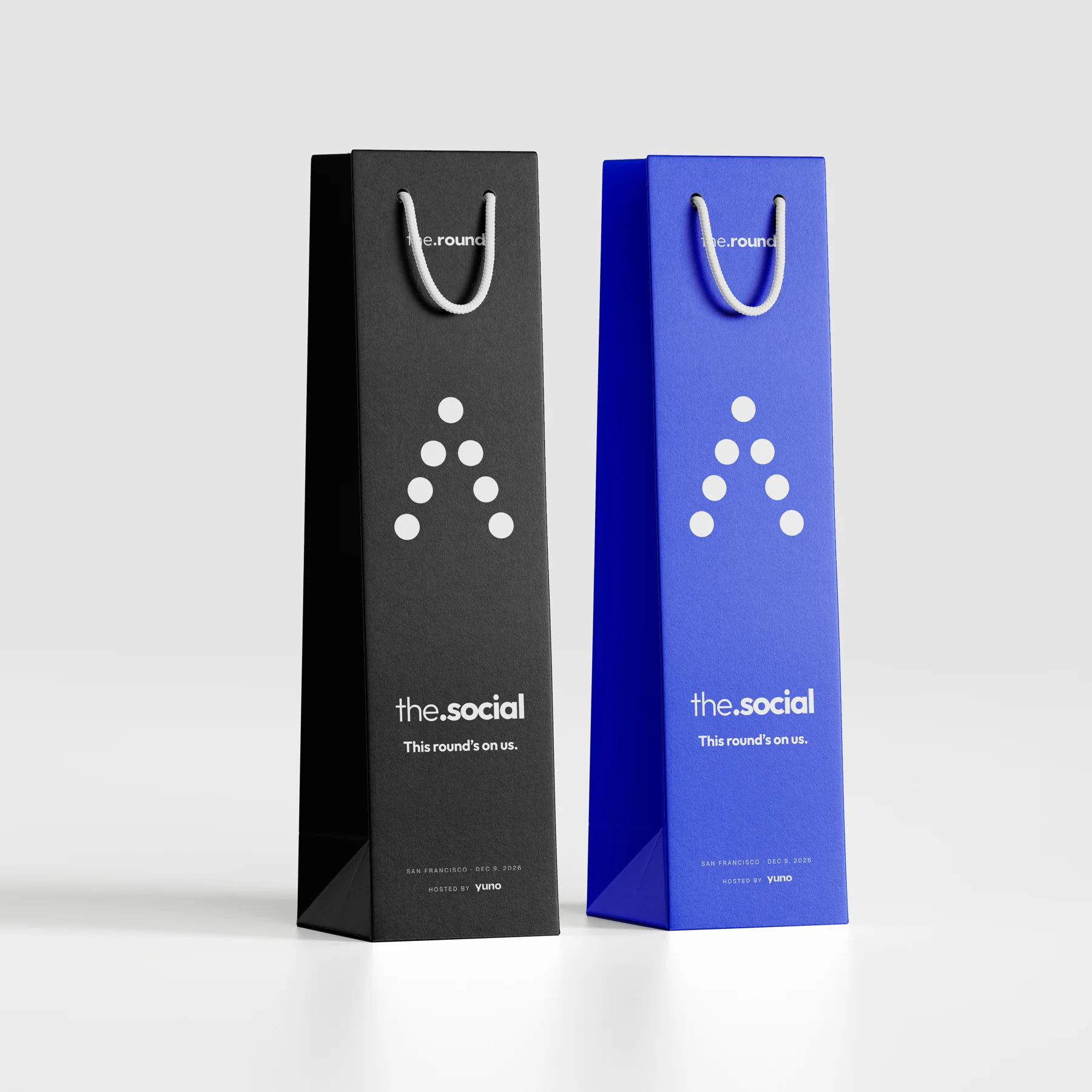
Each format got its own object, made to be kept, worn or carried home.
One format per post.
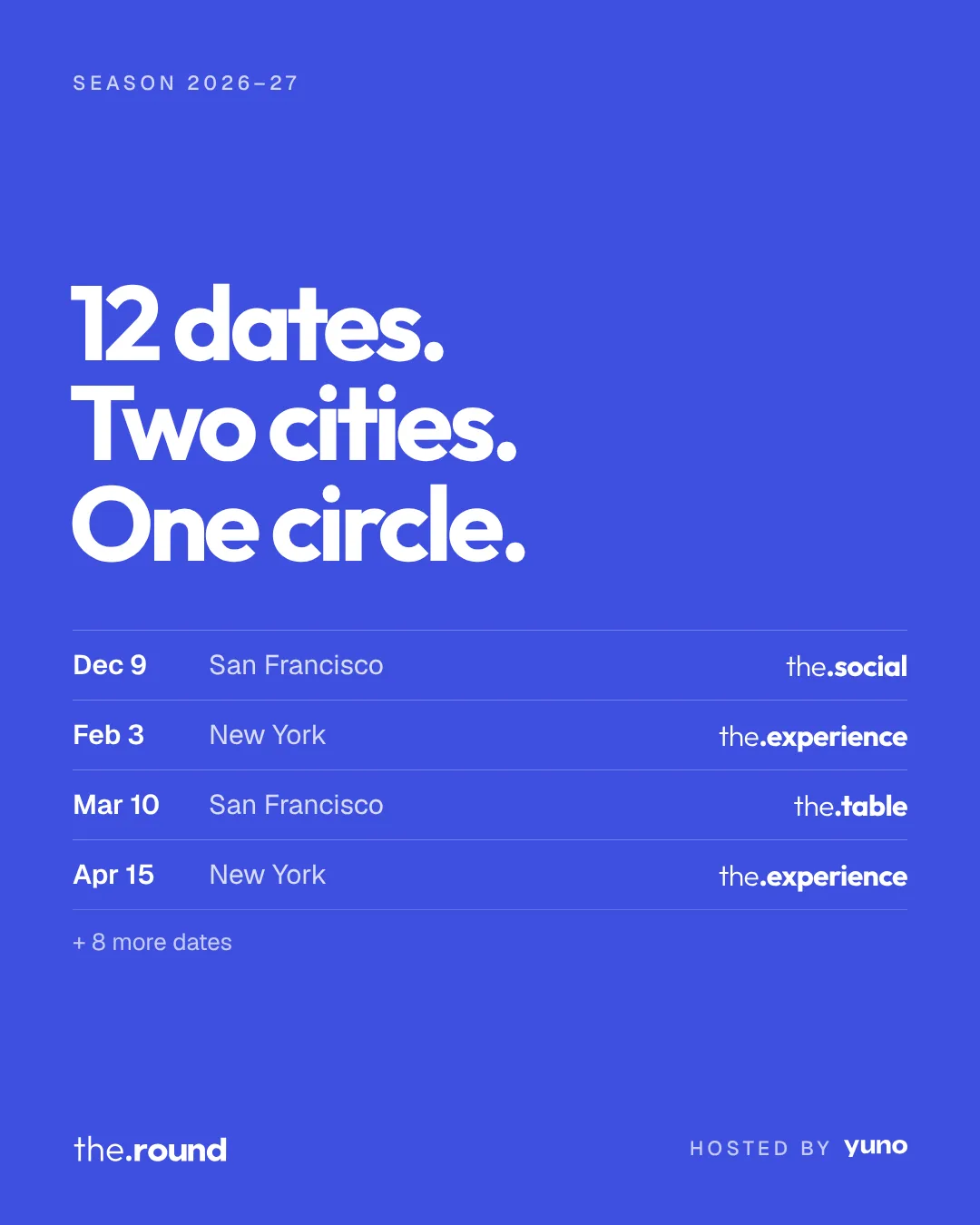
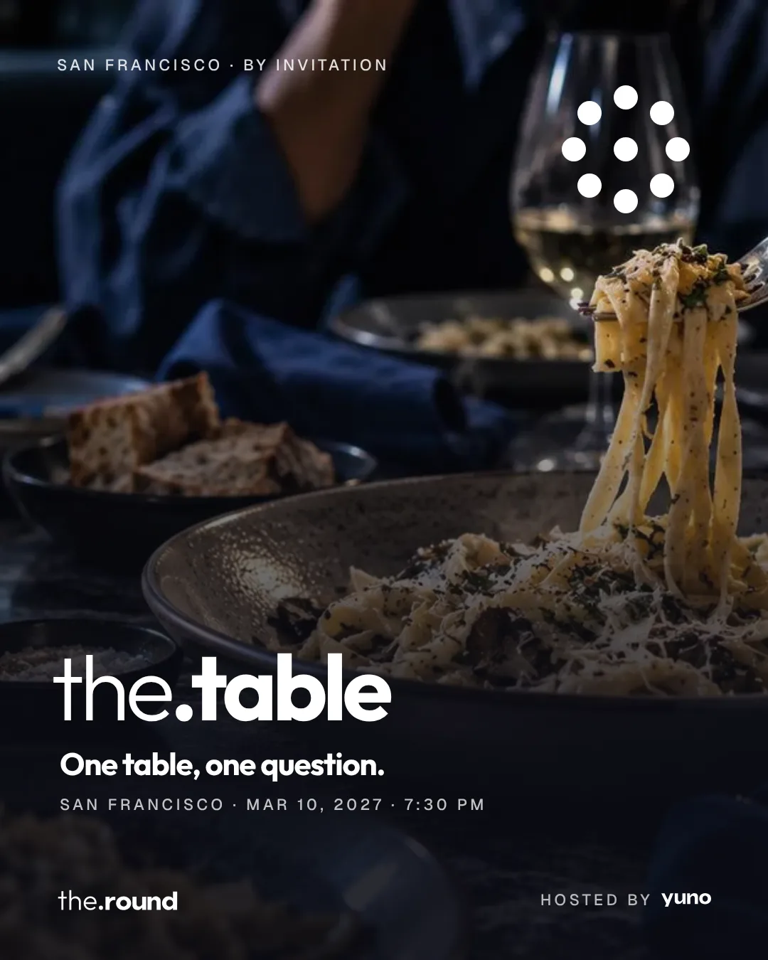
The season is announced one format at a time, with the photos doing the talking.
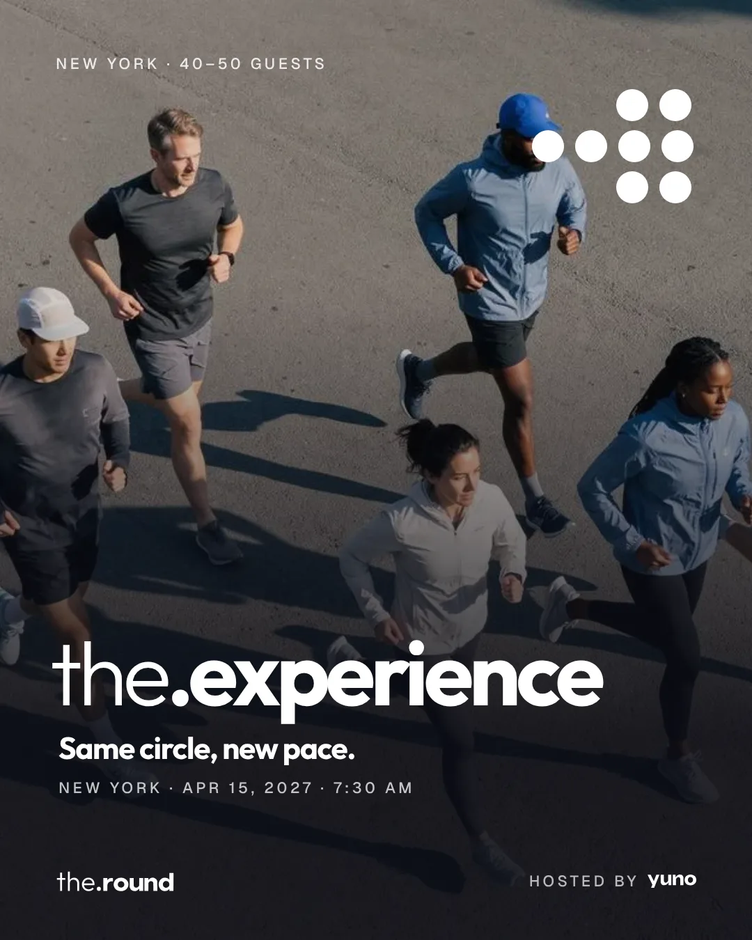
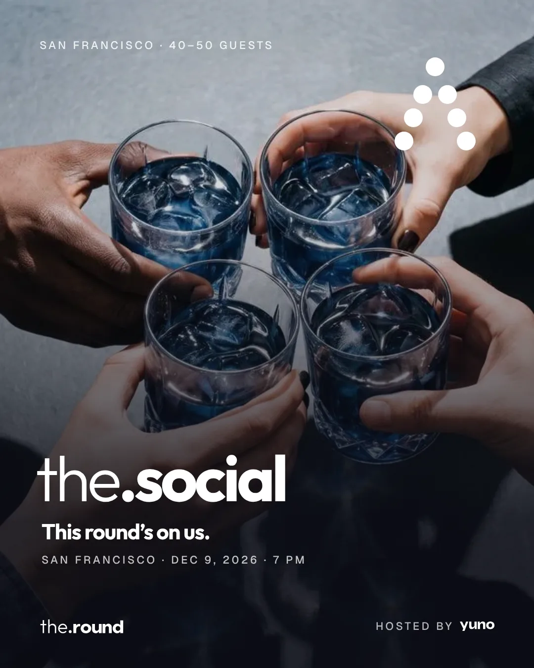
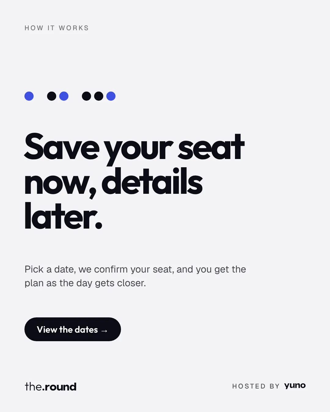
Drag to see the posts →
A community with its own name, inside the Yuno family.
the.round got a brand that works from a 15-person dinner to a 50-person social. Logo, system, page, print and posts speak the same language, so every invitation feels like part of one season, and like Yuno, without saying so.
- Naming structure
- Logo and dot system
- Format symbols
- Palette and typography
- Tone of voice
- Image direction
- Landing page and motion
- Invitation, wristband and wine bag
- Social posts
- Case film