PuroSwap
A full rebrand for a service that swaps PIX for crypto. The brand left the typical crypto look behind and moved closer to a banking app: familiar, clear and easy to trust.
- Client
- PuroSwap
- Industry
- Technology
- Year
- 2026
- Role
- Graphic designer and creative director
- Deliverables
- Symbol, logo, color, type, tagline, voice, brand book, social, website and film
Why change?
PuroSwap swaps PIX for crypto with no account and without holding anyone’s money. But the old brand didn’t convey that trust.

- 01A bad kind of crypto association.
Navy, cyan glow and circuitry: the market’s usual look, which reads as easy promises and breeds distrust.
- 02A generic logo.
An S with arrows and circuit dots. It could belong to any tech company.
- 03Hard to read from afar.
Wide caps, a tiny descriptor and glow: it vanished on phones, in the favicon and in the avatar.
- 04Not very memorable.
Nothing in it told what Puro does. Hard to remember and to tell apart.
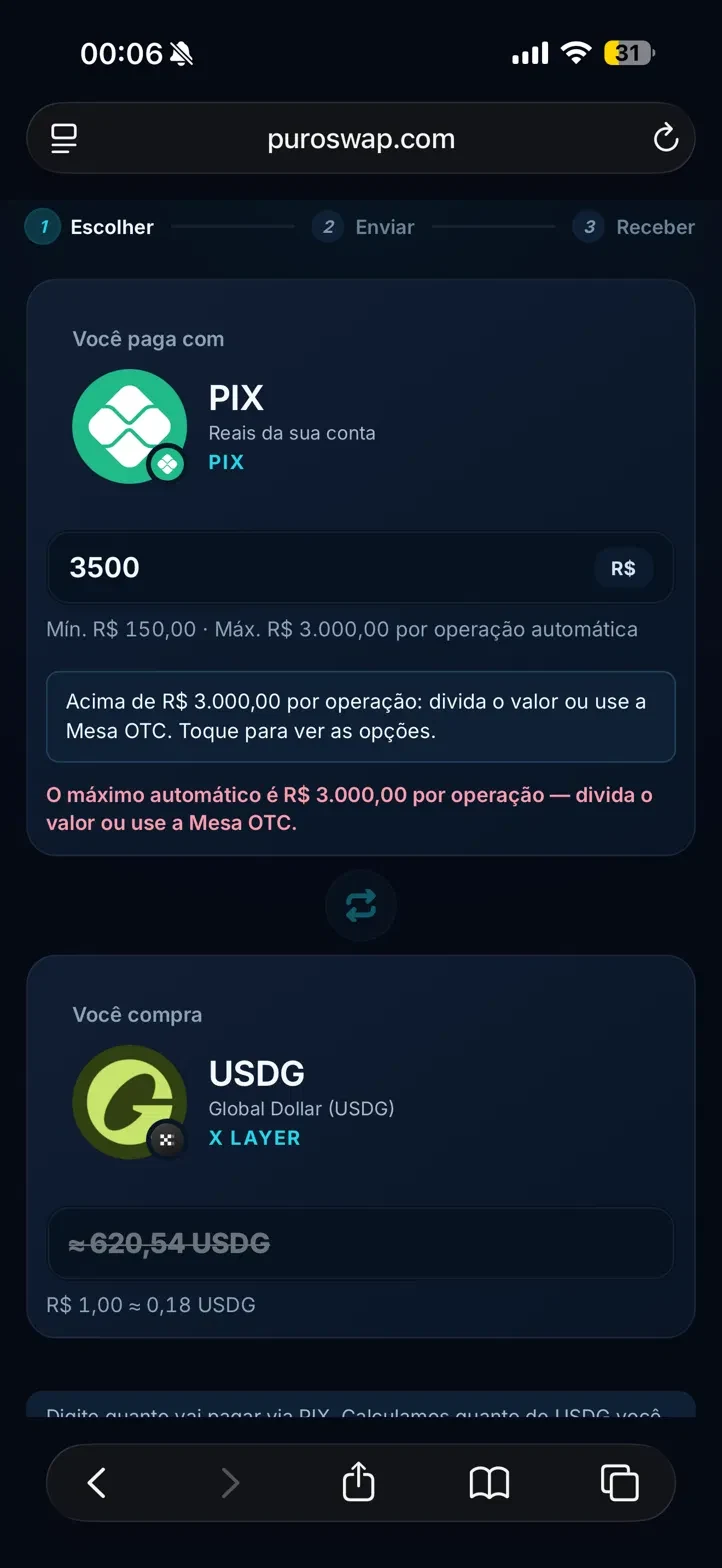
The platform carried the same problems: dark blue background, cyan glow and too much information competing for attention at the moment of the swap. Scroll to see the swap.
The simplest way to swap PIX for crypto, without handing your money to anyone.
Swap with no sign-up and no exchange account.
Crypto goes straight to your wallet. Nothing sits still.
The amount and the fee show before you send.
From PIX to wallet, with the time on screen.
Instead of looking like another crypto site, Puro now feels like a banking app: something people already know and trust more easily. Puro means pure: nothing hidden.
People who want to use crypto without living in it.
Brazilians aged 30 to 60 who want to use crypto but don't live in it. Many are self-employed.
To swap without opening an exchange account, with the money in their own wallet.
Crypto feels complicated. They fear scams, picking the wrong network, and anyone who holds a balance.
Through influencers and partners. They trust whoever referred them before they trust the brand.
PIX ⇄ crypto.
Simples assim.Simple as that.
It says what the brand does in three words and answers the audience's biggest fear: “crypto is complicated”. The ⇄ is the symbol's two-way street written as text. Abroad, only the ending changes.
The arrow loses its heads and becomes a mark.
- 01The ⇄ arrow
The starting point: the universal sign for a swap, both ways.
- 02No heads
The shafts thicken into two bars: going and coming back.
- 03Heads become dots
Value on the move, one each way. Orange only shows up here.
- 04Two-way street
PIX becomes crypto, crypto becomes PIX. Drawn on a 48-unit grid and tested at 16px.
- 01It shows the swap.
Two pills going opposite ways: money goes, crypto comes back. The whole product, drawn.
- 02Easy to read.
Lowercase name in Inter, no outline, no wide caps. Readable at a glance, even on a small screen.
- 03It builds the system.
The same parts become icons, buttons, value pills and the supergraphic.
- 04It lives in one color.
Stamp, embroidery, pin or screen: it works flat in black, white or orange.
- 05It feels like a bank.
No gold coin, rocket or circuit. The new one recalls the finance apps people already use, and that brings them closer.
The swap got a color.
The rule of one: one accent color, one typeface, one action per screen, one idea per post.
The crypto market’s usual colors: four accents and no meaning.
Swap #FF4D00 · RGB 255, 77, 0
Terminal #0A0A0A · RGB 10, 10, 10
Pixel #FAFAFA · RGB 250, 250, 250
Hash #DEDEDE · RGB 222, 222, 222
Why orange?
- 01It stands out.
In a market of navy and purple, orange is recognizable from afar.
- 02It's value on the move.
Used sparingly, always where something moves.
- 03It's the color of safety.
Life vests, buoys and black boxes are orange: the color you see when it matters.
- 04Warm, not alarming.
Energy and closeness, without becoming error red.
No fine print.
Inter. One family, three weights.
- DisplayInter 600 · −5%
- PIX ⇄ crypto.
- HeadingInter 600 · −3%
- Review before you pay
- AmountInter 600 · tabular
- R$ 500.00
- BodyInter 400 · 16 to 18
- You receive it straight in your wallet.
- LabelInter 500 · uppercase
- Time left
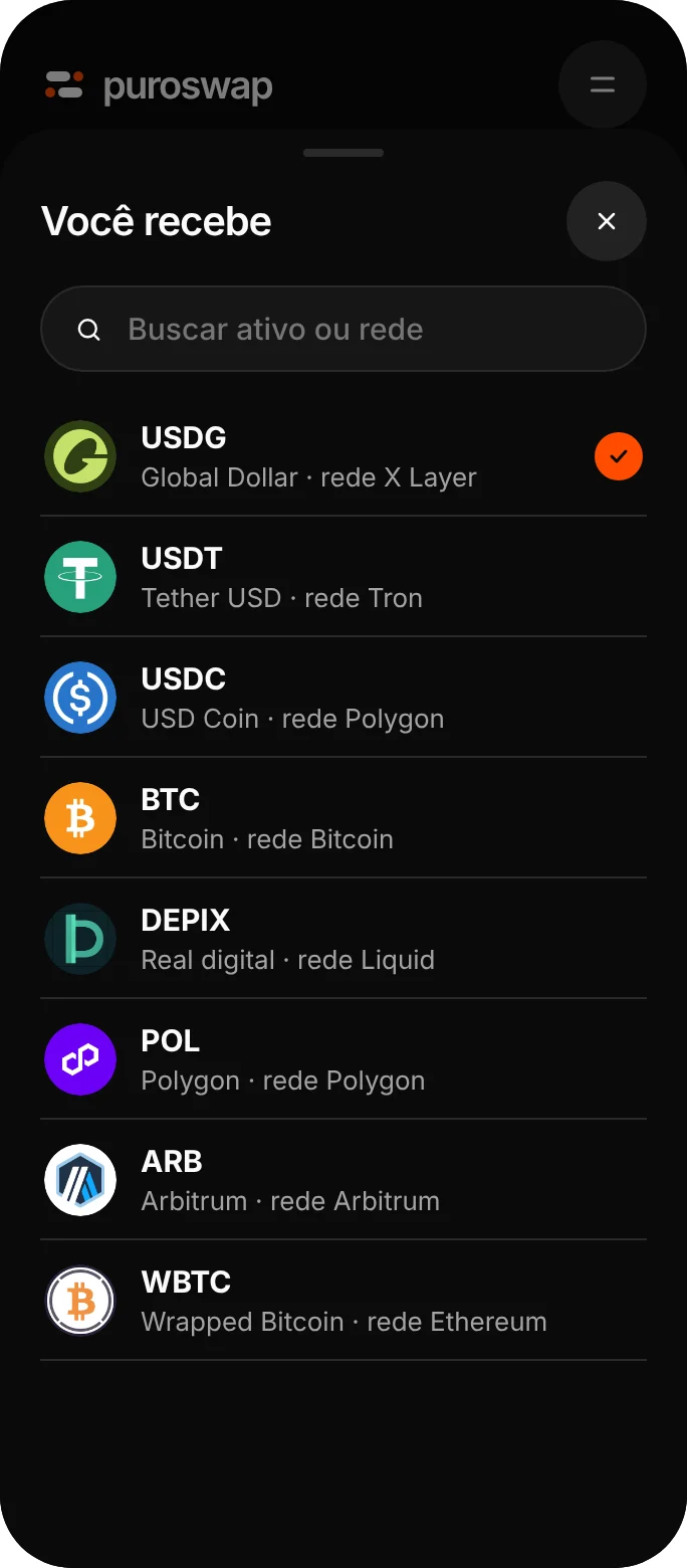
The parts that build everything.
 PIX
 USDGPIX
 DePixUSDG
 USDT
 USDC
 BTC
 WBTC
 ETH
 POL
 ARB
Four words guide everything Puro says and does.
- Direct.Says what it is in one sentence.“The fee shows before you send.”
- Sober.No hype, no slang, no rockets.“It takes 2 to 15 minutes.”
- Precise.Fee, time and amount always clear.“R$ 500 becomes 92.42 USDG.”
- Discreet.Doesn't hold, doesn't expose, doesn't overpromise.“We don't hold your balance.”
Speaks like someone who knows and doesn't need to prove it.
The fee shows before you send.
The best rates on the market!
We don't hold your balance.
Your security is our priority.
Arrives in 2 to 15 minutes.
Ultra-fast transactions.
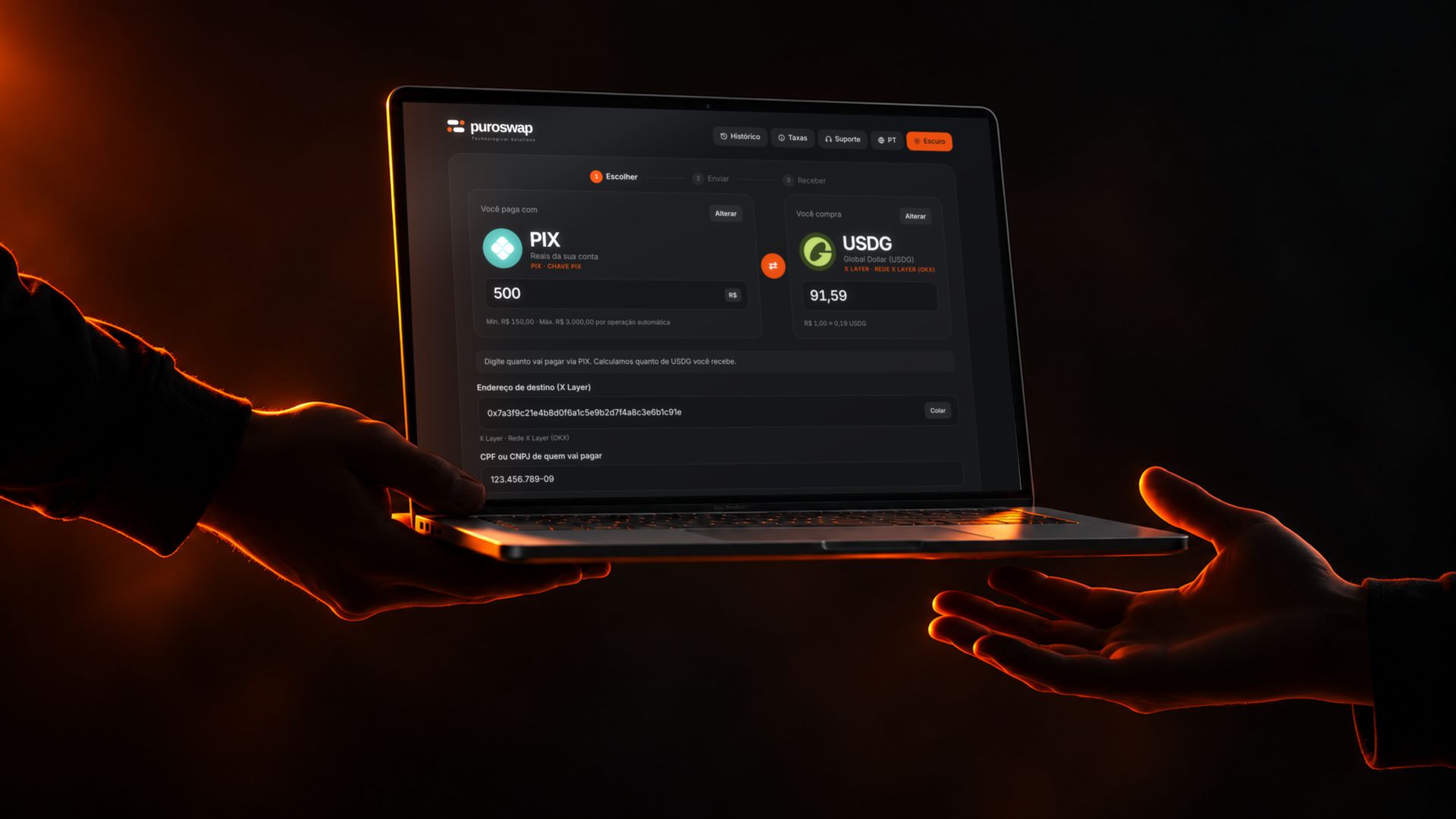
Ordinary people, everyday life. The focus is the gesture: a hand on the phone, on the keyboard, a step on a run. Never a face in the spotlight.



- Dark setting, warm light
- The gesture, not the face
- Real Puro screens
Faces in the spotlightGeneric stock photosGold coins, rockets, neonScreens with made-up text
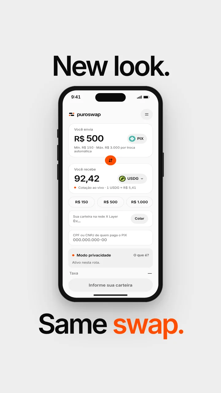
New look. Same swap.
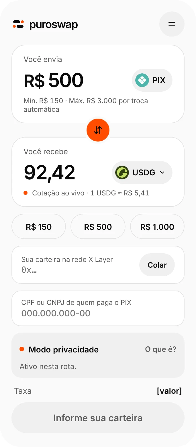
The same form, redesigned for people who are afraid of getting it wrong. The same swap running at the same time in both themes: amount, wallet, review, PIX and confirmation.
- 01The brand reads at a glance.
Lowercase logo and a simple symbol: people recognize Puro before typing any amount.
- 02You know where you are.
Three highlighted steps: choose, send, receive.
- 03Amounts are big.
What you send and what you get, at reading size.
- 04Color points to the action.
Orange only shows on the ⇄ and the current step.
One idea per post.
Instagram, X and LinkedIn with the same profile, custom highlights and orange pointing to what matters.

Puro Swap
PIX ⇄ crypto. Simple as that.
No account. Fees on screen before you send.
Worldwide
puroswap.com
Puro Swap
@puroswapPIX ⇄ crypto. Simple as that. No account, fees on screen before you send.
New look. Same swap.
Puro Swap
PIX ⇄ crypto. Simple as that. Swap without opening an account.
Financial services · Worldwide · 2,140 followers · 11–50 employees
Today Puro Swap unveils its new brand. Same swap, now with an app’s look: one screen, the fee before you send, nothing held along the way.
A brand that makes crypto feel simple and safe
The rebrand solved PuroSwap’s biggest challenge: earning trust in a market that still scares many people. With strategy, symbol, tone of voice and visual system in place, the site, app and social channels now speak the same language, and the brand is ready to launch, win its first customers and grow.
- Strategy and positioning
- Symbol and logo system
- Palette and typography
- Tagline and tone of voice
- Icons and UI elements
- Brand book
- Redesigned site and app
- Templates for Instagram, LinkedIn and X
- Launch film