Academic Leadership Symposium
The brand for Maple Bear’s annual gathering of academic leaders, a book that opens into a leaf, and the theme of the 2027 edition: The future we shape.
- Client
- Maple Bear Brasil
- Event
- January 14–15, 2027 · PUC-Campinas
- Role
- Graphic designer and creative director
- Deliverables
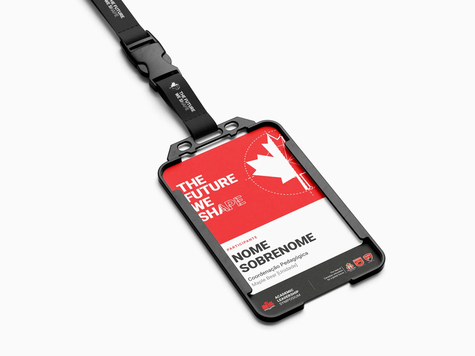
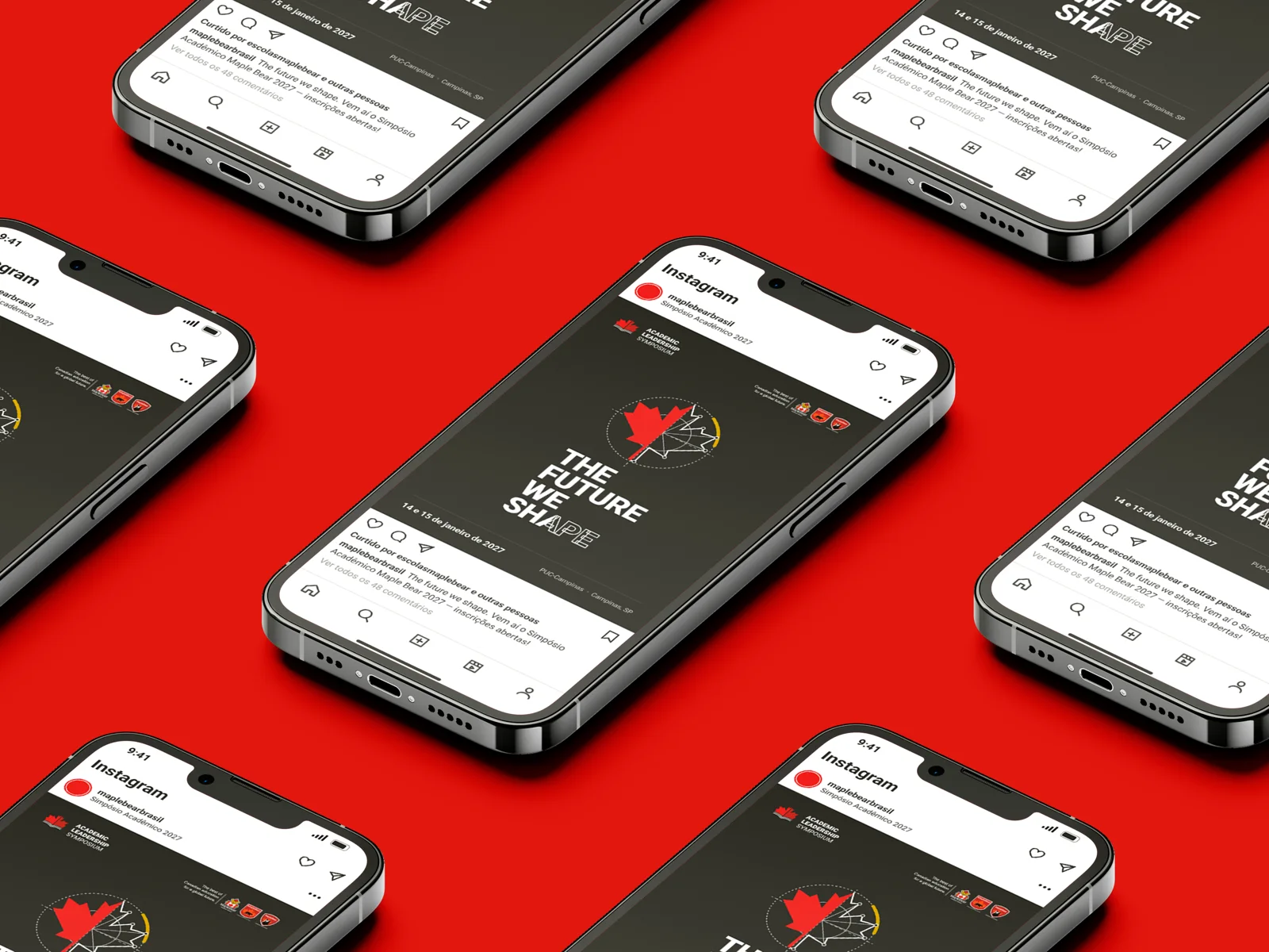
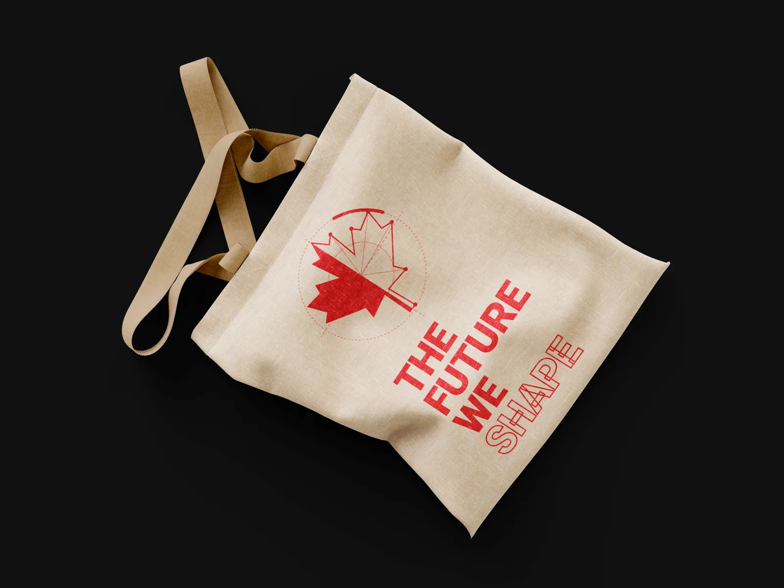
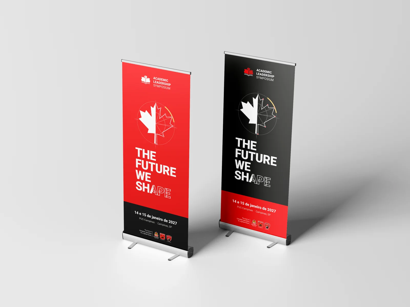
- Event identity, edition theme, stage screen, badge, folder, roll-up, tote and social
A brand that stays, a theme that changes.
The symposium happens every year, with a new theme each edition. The identity had to work in two layers: a fixed brand people recognize from one year to the next, and a theme with a life of its own that can change without messing up the house.
Stays.
Academic Leadership Symposium. The same signature in 2027, 2028, 2029…

Changes.
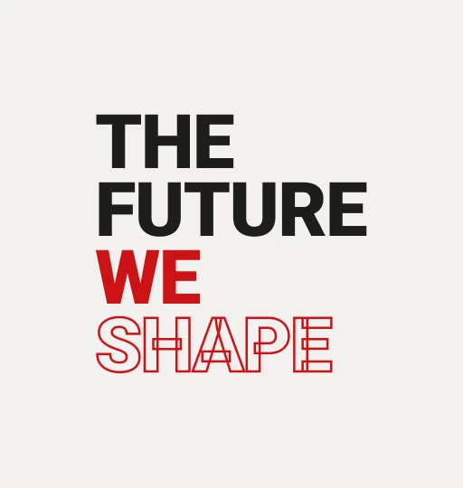
Each edition’s theme. In 2027: The future we shape.
A book
that opens
into a leaf.
As the pages open, they draw the outline of the maple leaf: learning and teaching with Maple Bear’s face.
Three backgrounds,
one rule.
The leaf stays red whenever it can. On red, everything turns white, and the second page goes light pink so it keeps its depth.
The leaf under construction.
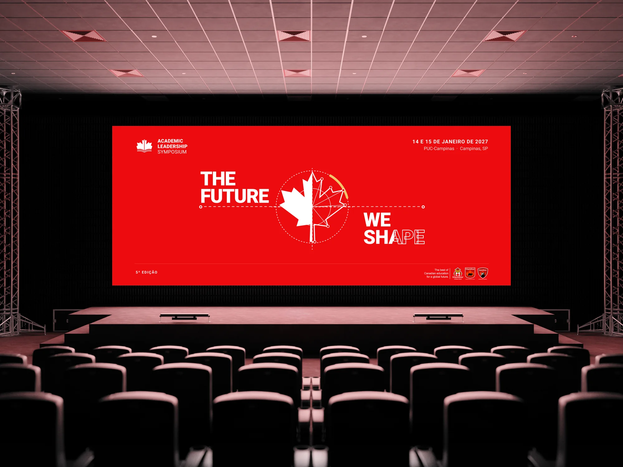
At the 2027 Symposium, the maple leaf shows up halfway: one half finished, the other still a line drawing, with its construction lines in plain sight.
A word still being written.
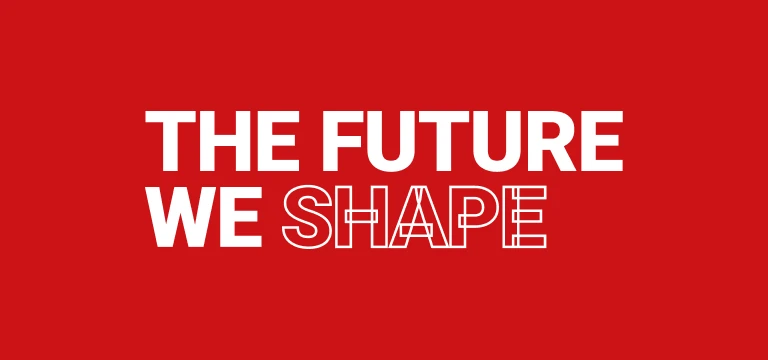
Even without the leaf, the signature tells the story. WE is solid, SHAPE is only an outline, like a word still being written. It’s the same gesture as the leaf: one part done, another under construction. Hover to watch it again.
One theme, many formats.
Horizontal, vertical and name only, in red, light and dark, for the stage screen, the badge, the post and the roll-up.



The Maple Bear palette, used with intent
Two reds for the two pages, black and white to breathe, and honey only in the theme. Click a color to copy its code.
- Roboto BlackHeadlines and signature
- ROBOTO BOLDUppercase labels
- Roboto Medium and RegularText, dates and details
From stage screen to badge.
The theme on everything attendees see and take home.
One symbol for every edition.
One theme just for this one.
The symposium got a brand built to last: the symbol carries over from one edition to the next and only the theme changes. Each new year starts with the identity ready, the event builds recognition over time, and every edition still has room to tell its own story.
- Fixed event brand
- Book-leaf symbol
- Versions and pattern
- Edition theme
- Theme signatures
- Palette and typography
- Stage screen
- Badge and lanyard
- Folder
- Roll-up
- Tote bag
- Social posts