Vitória Massas
Visual identity, packaging and a product catalog for a family pasta kitchen that has cooked with tradition and quality since 2003.
- Client
- Vitória Massas
- Industry
- Food · Homemade pasta
- Role
- Graphic designer and illustrator
- Year
- 2025–2026
- Deliverables
- Concept, character, logotype, variations, palette, typography, illustrations, packaging, applications, social and catalog

Recipes passed down,
plated with care
Vitória Massas started in 2003 with Dona Leonilda, who always found joy in cooking for her family. The recipes are still made the same way today: good ingredients, patience and a taste that never misses.
The brand had to carry that home-kitchen warmth from the Thursday farmers' market to corporate events, school contracts and birthday tables.
From her photo to the logo
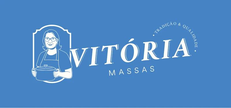
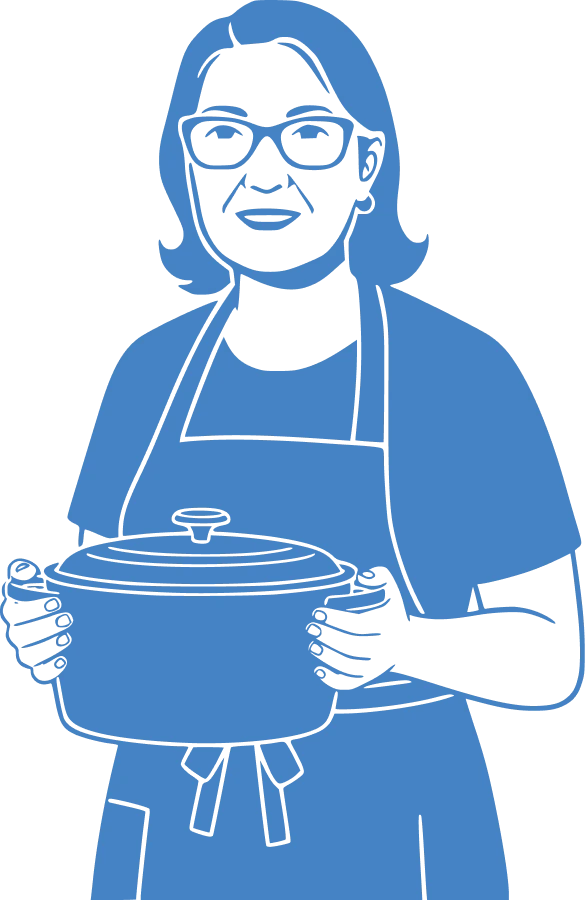
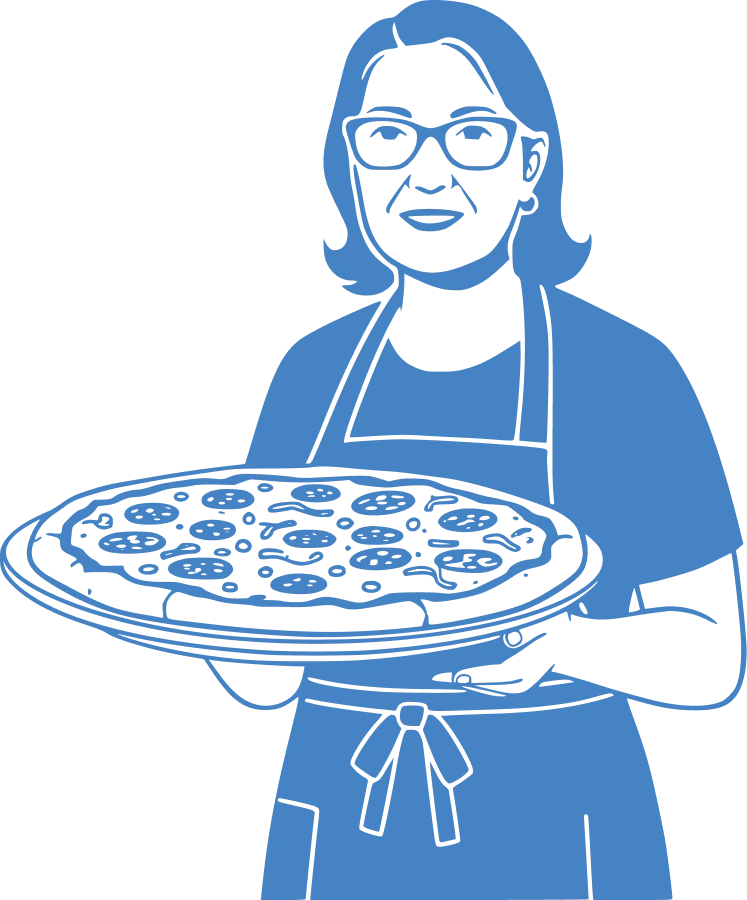
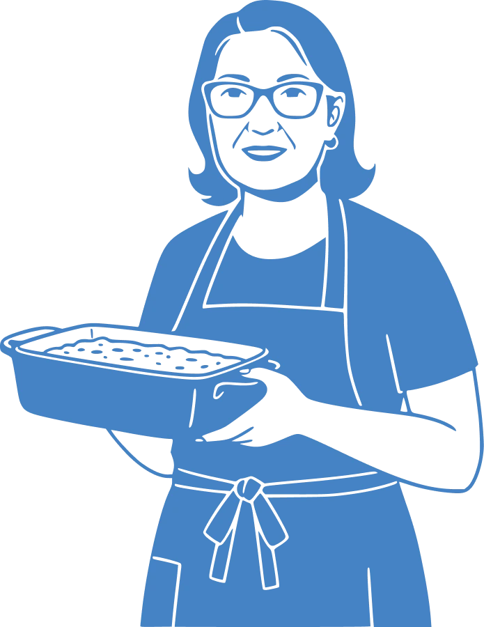
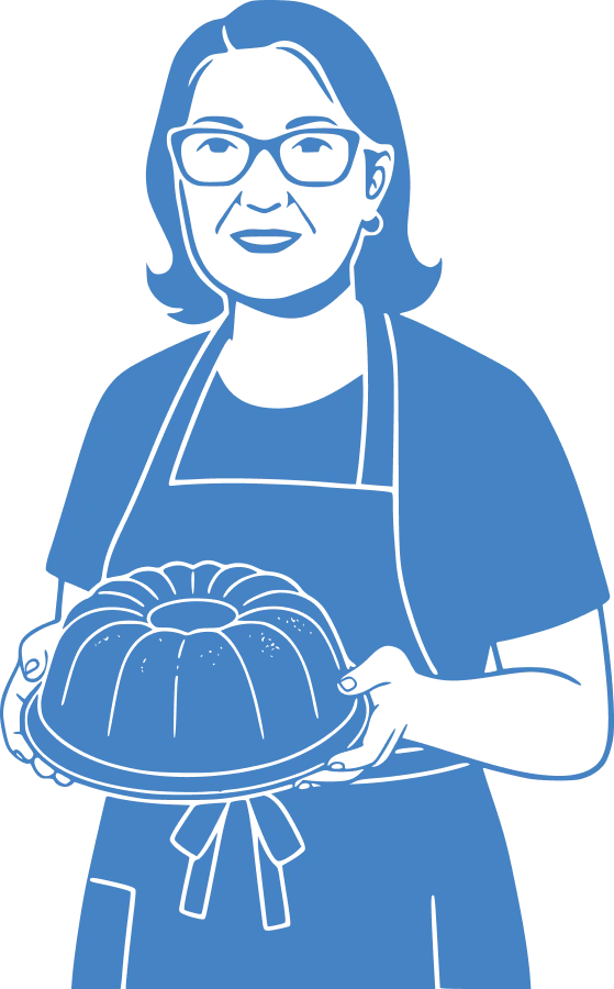
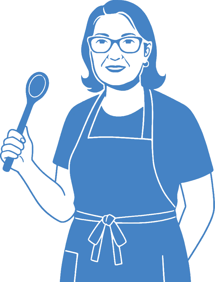
The most trusted thing about the business is the woman behind the stove, so I drew Dona Leonilda from a photograph and built the whole mark around her. Keep scrolling to watch it come together.
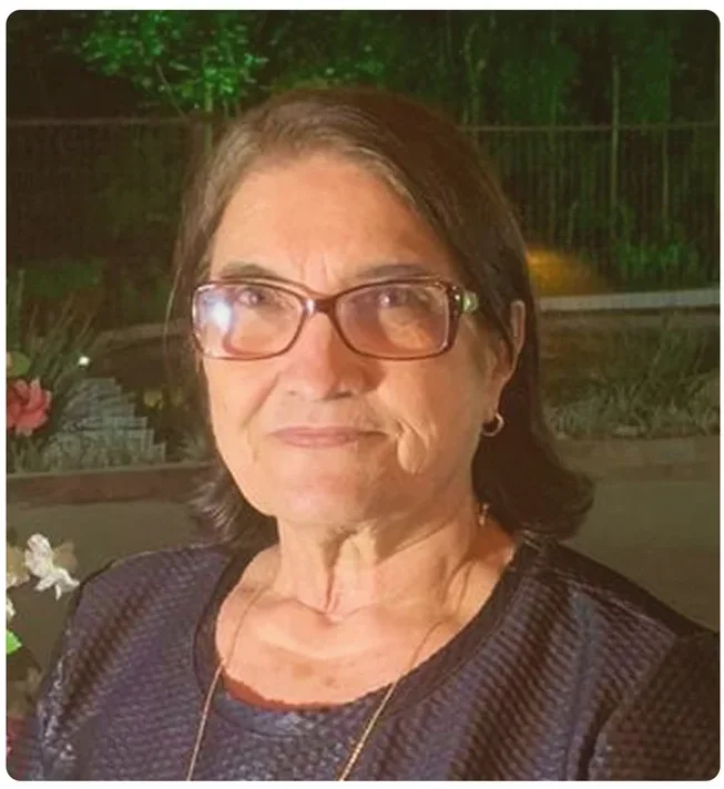
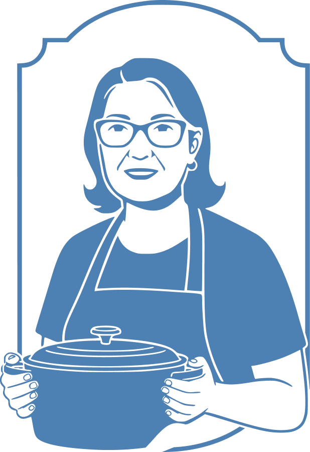

Leonilda's portrait, glasses and apron included, turns the brand into a promise from a person rather than a factory.
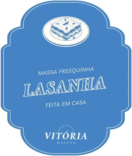
The arched label shape recalls old pantry labels, and it returns on every tray, page and price tag.
The wordmark tilts upward like a hand-written label, under the slogan Tradição & Qualidade.
Three ways to sign
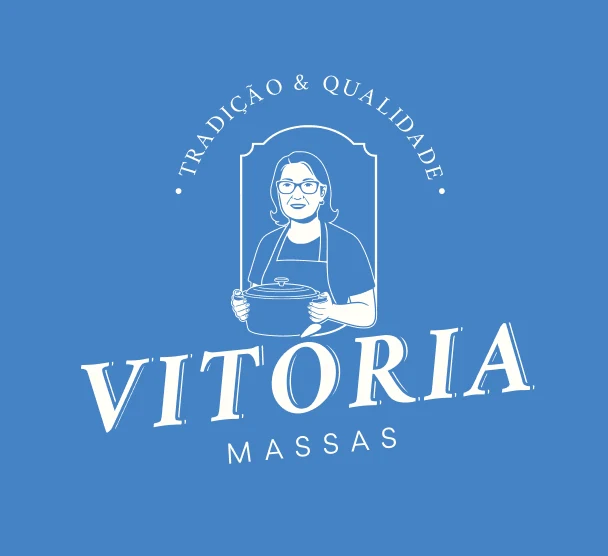
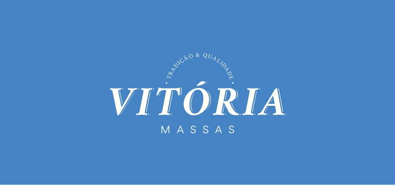
The full lockup, a wordmark with the slogan and a horizontal version.
Set the table
Four colors taken from a family lunch, each one printed on the brand's own label shape.
Click a color to copy its code.
Three voices
A handwritten script for the personal touch, an italic serif for tradition and a friendly sans that keeps menus and prices easy to read.
Handwriting brings the "made by hand" feeling of a home kitchen.
ABCDEFGHIJKLM
abcdefghijklm
Serifs read as tradition and trust; the italic adds a classic charm.
ABCDEFGHIJKLM
abcdefghijklm
A modern, legible sans that balances the elegance of Crimson Pro.
ABCDEFGHIJKLM
abcdefghijklm
Massa fresquinha
Lasanha
Feita em casa
Camadas bem servidas, molho saboroso e aquele aroma que já abre o apetite.
- Detail
- Playwrite IN Light
- Title
- Crimson Pro Bold Italic
- Label
- Livvic Medium, tracked
- Body
- Livvic Regular
Dona Leonilda

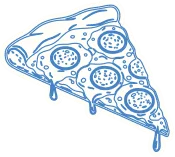
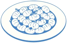
A menu drawn by hand
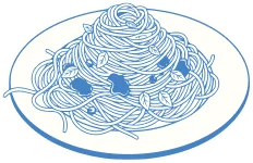
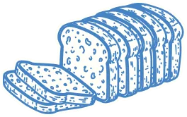
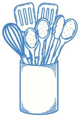
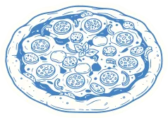
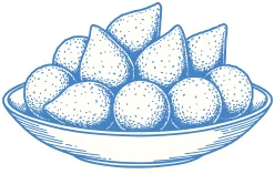
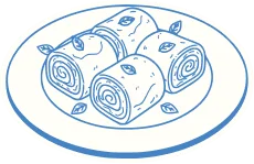
Twelve dishes in the same engraved line as the character. They label the trays, decorate the market booth and mark each section of the catalog.
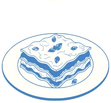
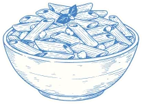
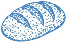
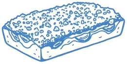
Labels you can taste
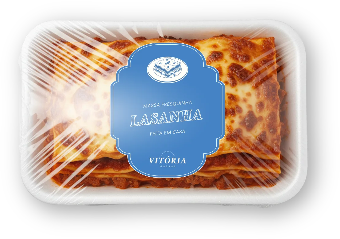
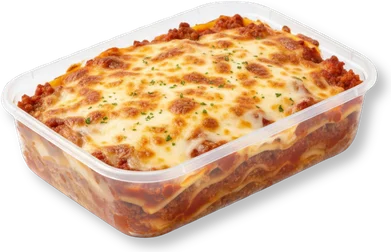
Lasanha
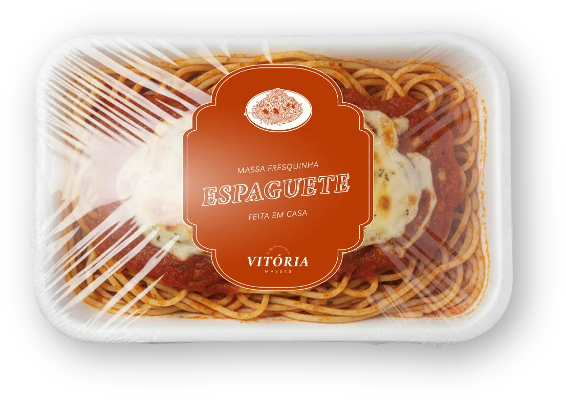
Each product gets its own color and drawing inside the label frame, so a whole fridge shelf reads as one family.
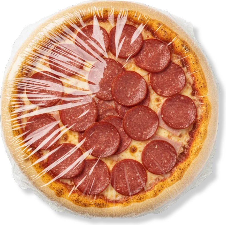
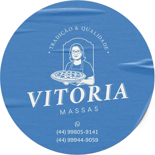
Seal of the house
Round stickers close the film on every pizza and carry the WhatsApp numbers, so the next order is one photo away. Swap the color:
Flip through the menu
A 23-page A4 catalog of products and services that takes the identity from the market stall to the sales pitch. Here are a few of its pages.
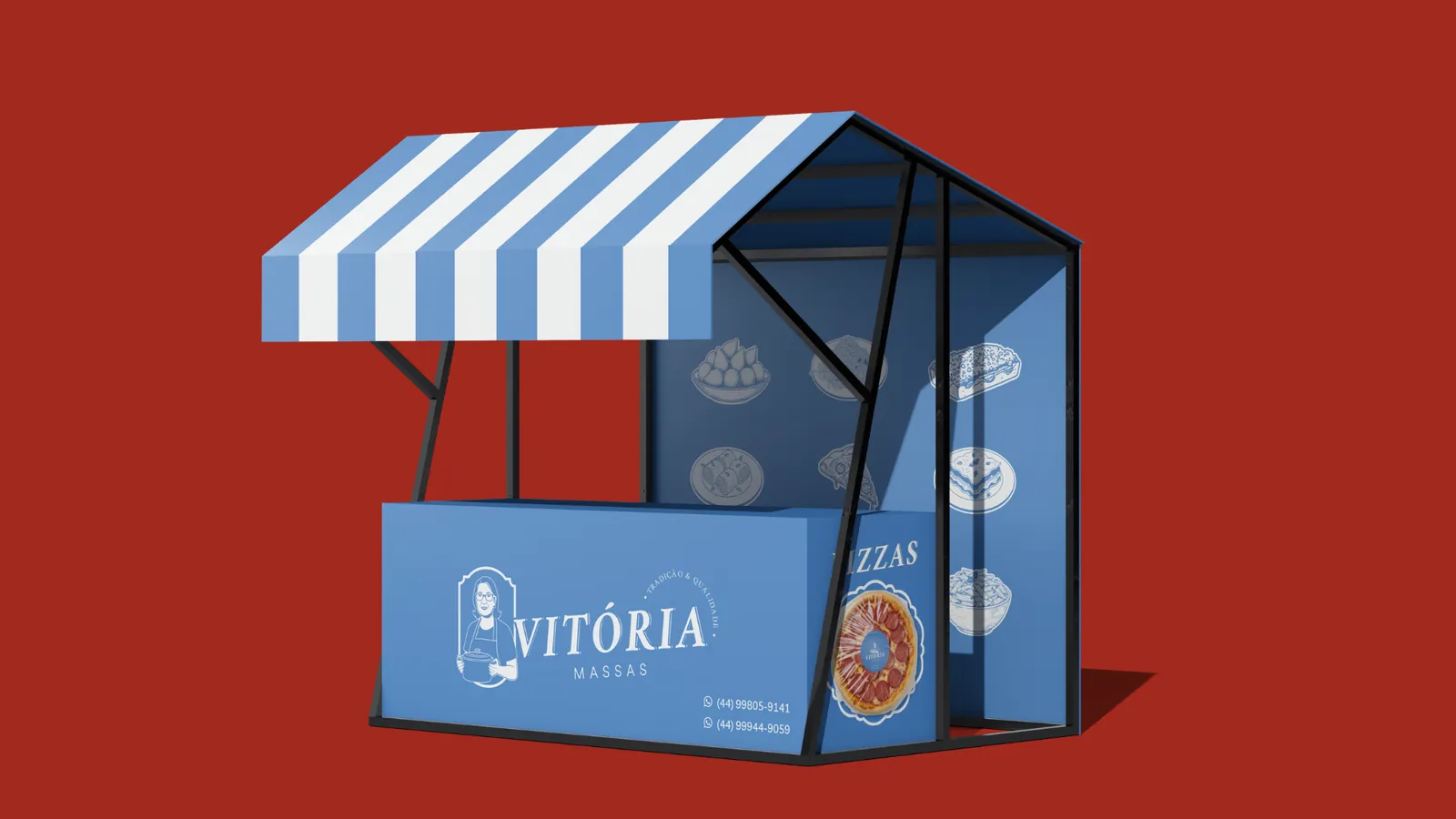
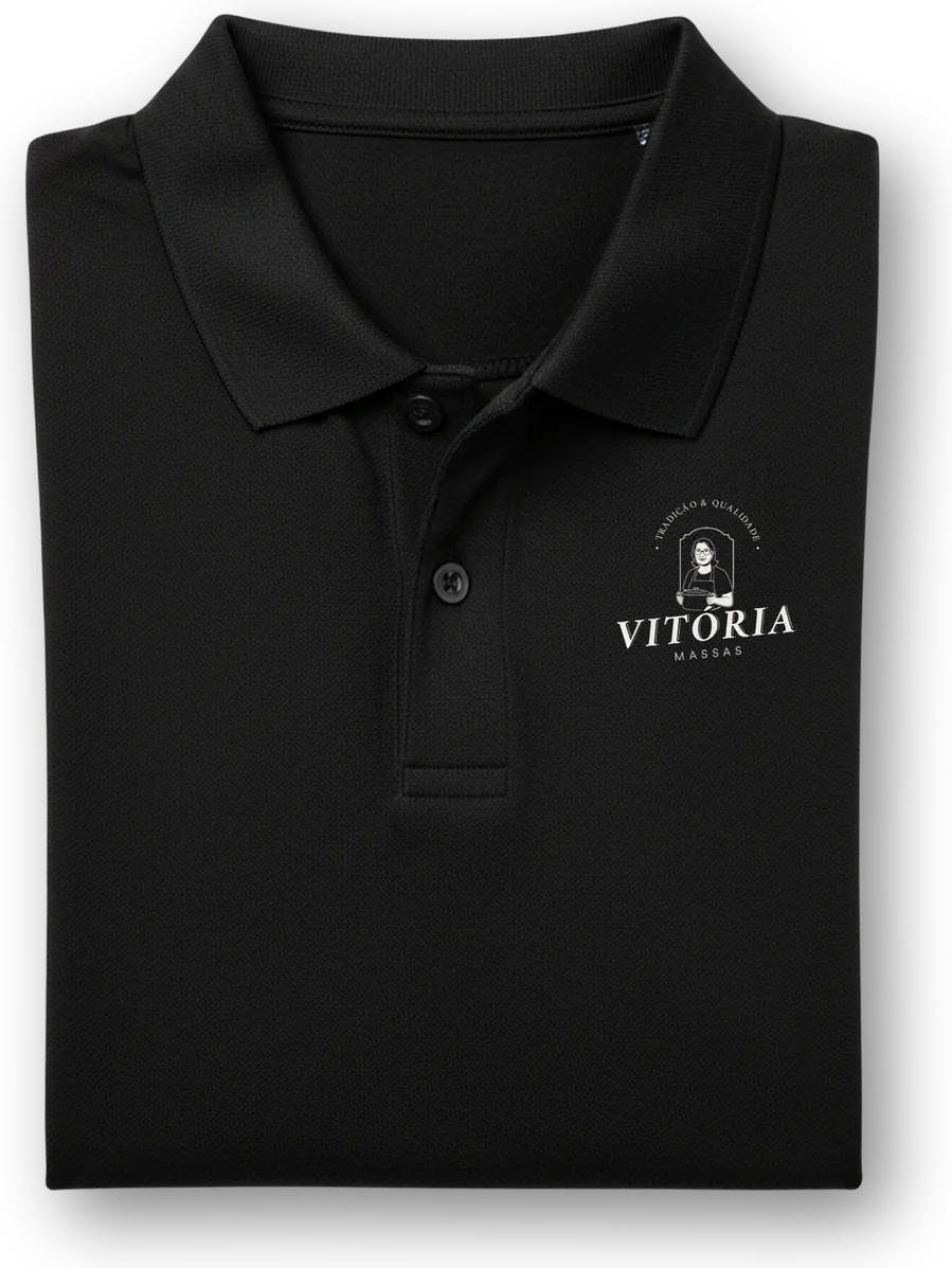
From the stall to the event
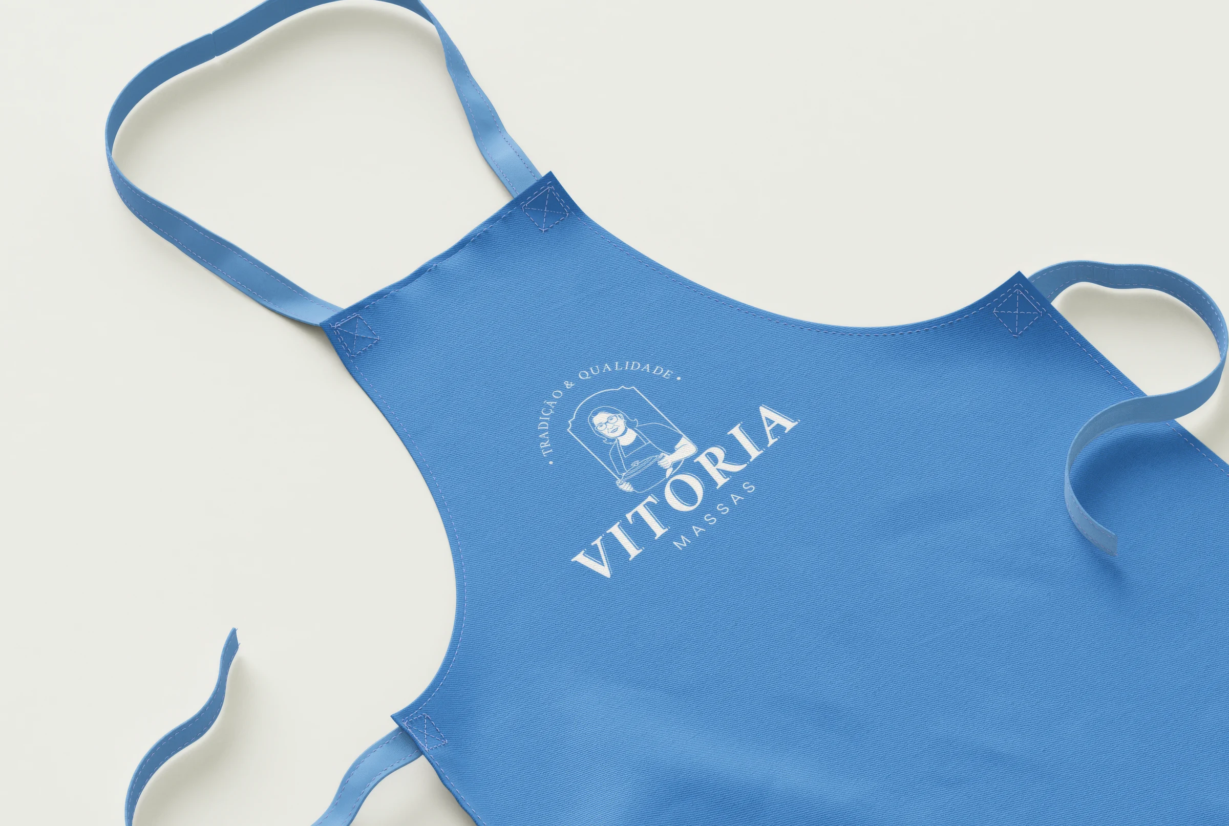
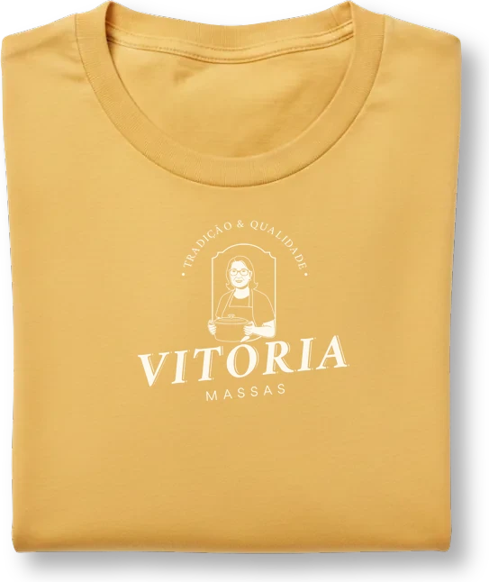
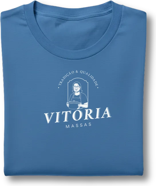
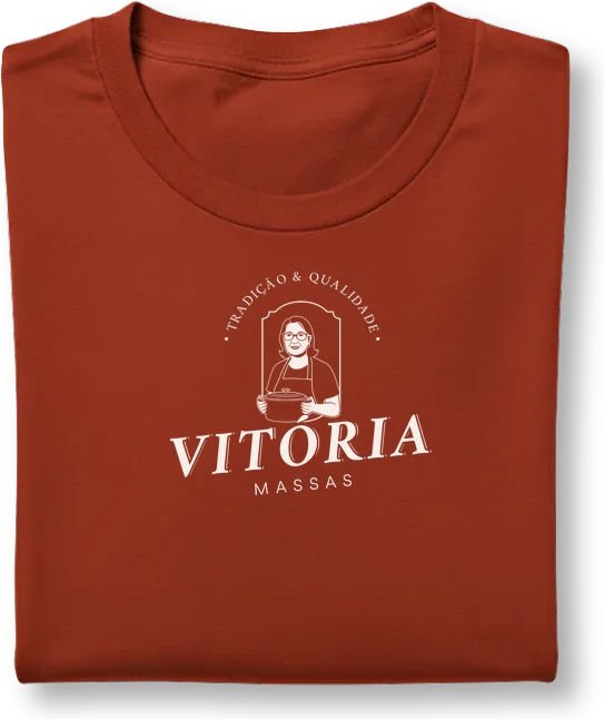
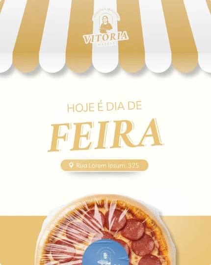
A striped booth for the Thursday market, uniforms for the kitchen and for catering.
 for
events
Orders happen on the phone
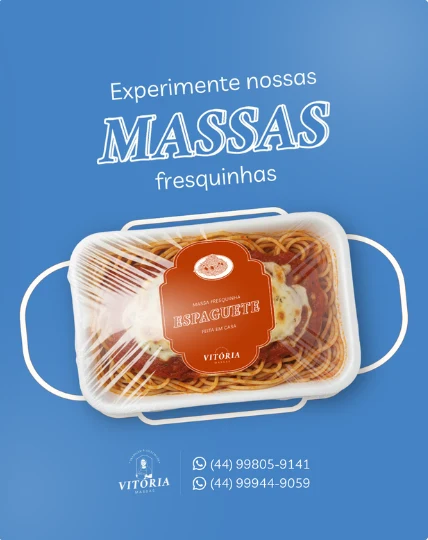
Most sales start in a chat, so the identity carries into an Instagram profile with highlights and post templates, and into a WhatsApp Business profile with the full catalog.
vitoria.massas
- 98 posts
- 500 followers
- 38 following
🍕 Massas, pizzas e outras delícias
📲 Pedidos e encomendas via WhatsApp.
ContatosFeirasEventosCardápio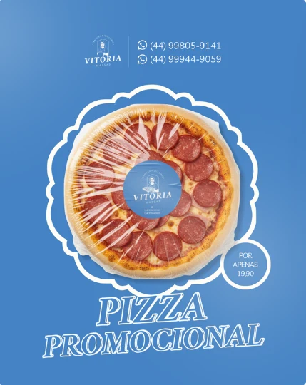
by chat
Vitória Massas
Homemade food
Lasanha
Message businessin hand