Terra Marketing
Visual identity and slide template for a marketing consultancy that helps authentic businesses grow with strong roots.
- Client
- Terra Marketing
- Industry
- Consulting · Marketing
- Role
- Graphic designer and creative director
- Deliverables
- Concept, symbol, logotype, variations, palette, typography, stationery, social and slide template
A brand built together with the founder
Nothing was designed in the dark. Each step came from the last: the conversations shaped the essence, the essence the values, the values the research, and the research the symbol that holds the whole system.
- 01Immersion
Conversations with the founder to understand what Terra is, who it serves and how it wants to be seen.
- 02Essence
The words she used to describe the consultancy became the essence and the six values.
- 03Research
Roots, connection and authenticity guided the search for references.
- 04Drafts
Nine symbol and logotype paths, tested and discussed together.
- 05Symbol
Roots meeting inside a square: a solid base and growth.
- 06System
Logo, variations, colors, type, stationery, social and slides.
Every step was presented, discussed and adjusted with the founder until the brand sounded like her: strategic, close and never formulaic.
A solid base to grow from
Terra is a marketing consultancy that works like an ecosystem: it connects people, ideas and creative paths so strategy leaves the page and grows with the business. Every project starts from human relationships, not ready-made formulas.
Its role is to help authentic businesses build a solid base, so they can grow with awareness, consistency and true to their own purpose.
Terra is born from the belief that growing well takes strong roots.
Six values that hold the brand up
Three words guided the drawing
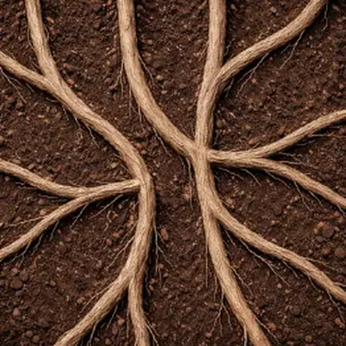
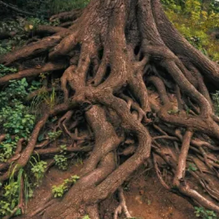
The words that came up most when the founder talked about Terra became the starting point. Before any line was drawn, the research gathered images of roots that cross, spread out and hold up what grows above.
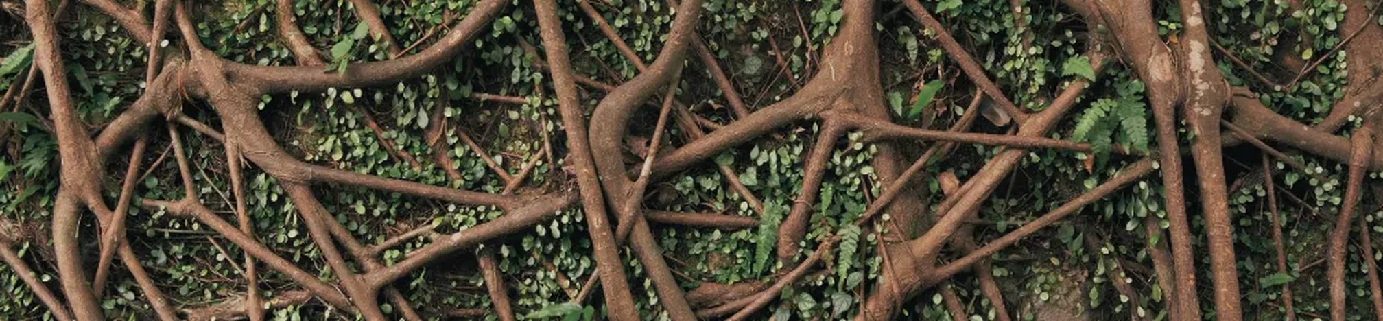
Roots that meet
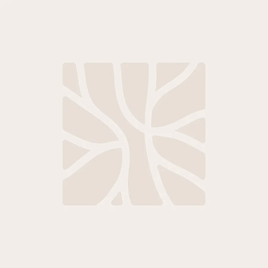
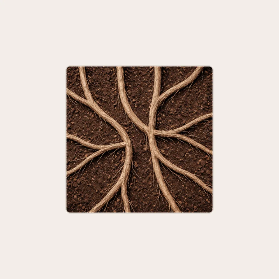
The research became a shape: roots that start at one point and connect inside a firm base.
Drag the line to see the roots inside the symbol.
One symbol, many ways to sign
Soil, root and sky
Sand for the base, terracotta for warmth and blue for trust. Three colors are enough for the whole brand. Click a color to copy its code.
Montserrat Alternates
Terra’s typographic identity uses Montserrat Alternates exclusively, a choice born from the wish to balance structure and authenticity, two pillars of the brand.
The family offers a solid, clear and contemporary base; the Alternates soften its rigidity and bring the type closer to something organic. From extra-thin to bold, a single family creates hierarchy, rhythm and contrast.
Weight 400
The same root at every touchpoint
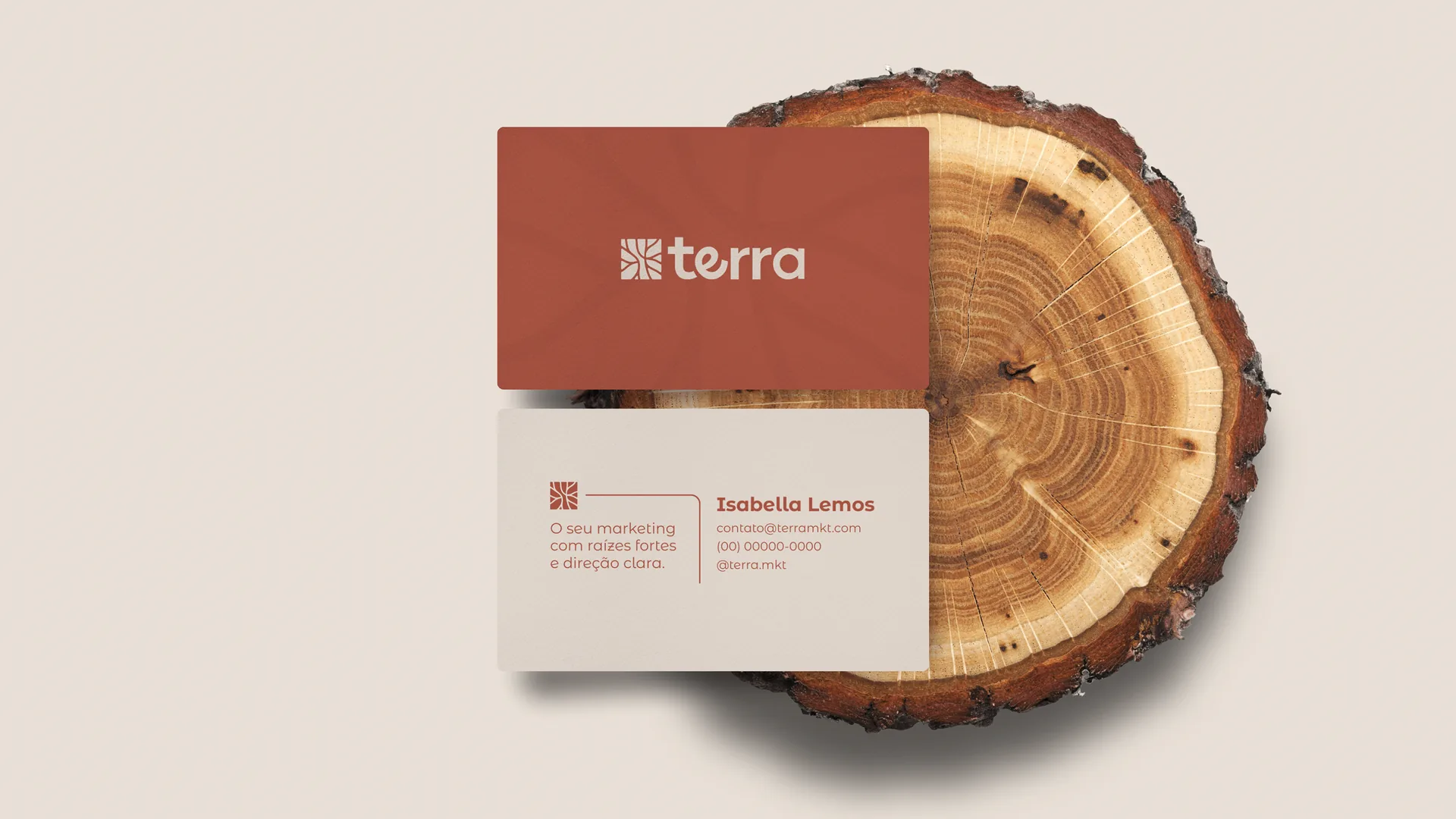
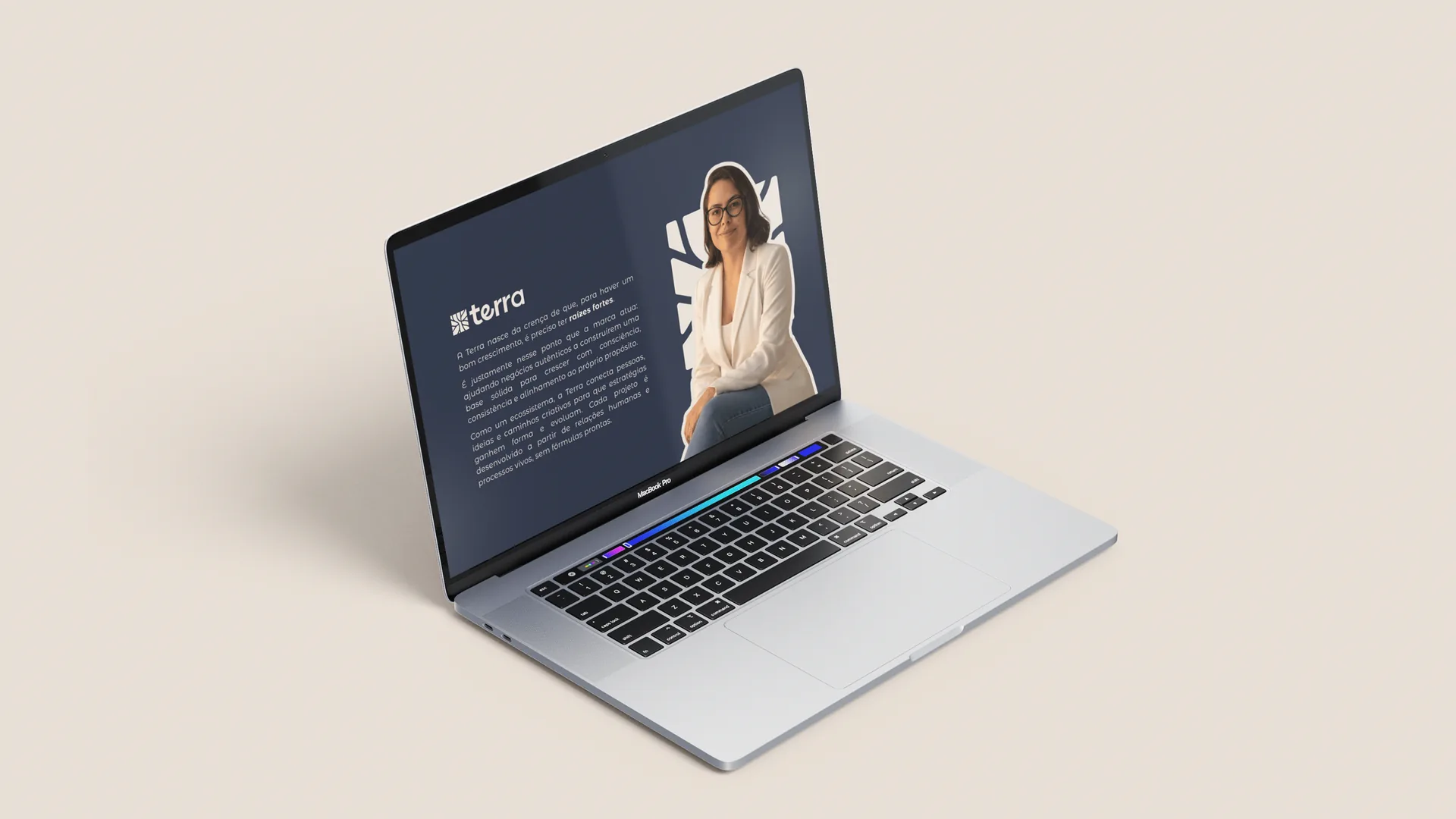
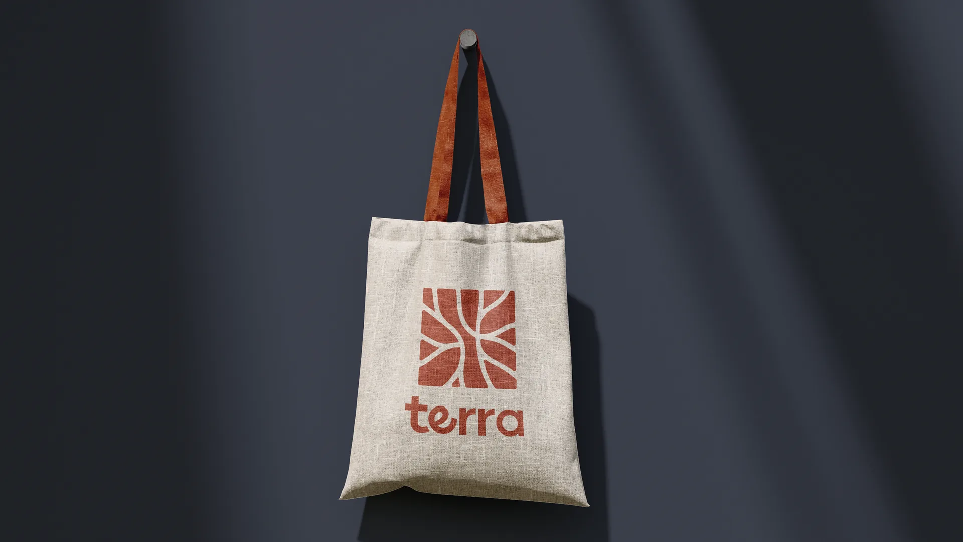
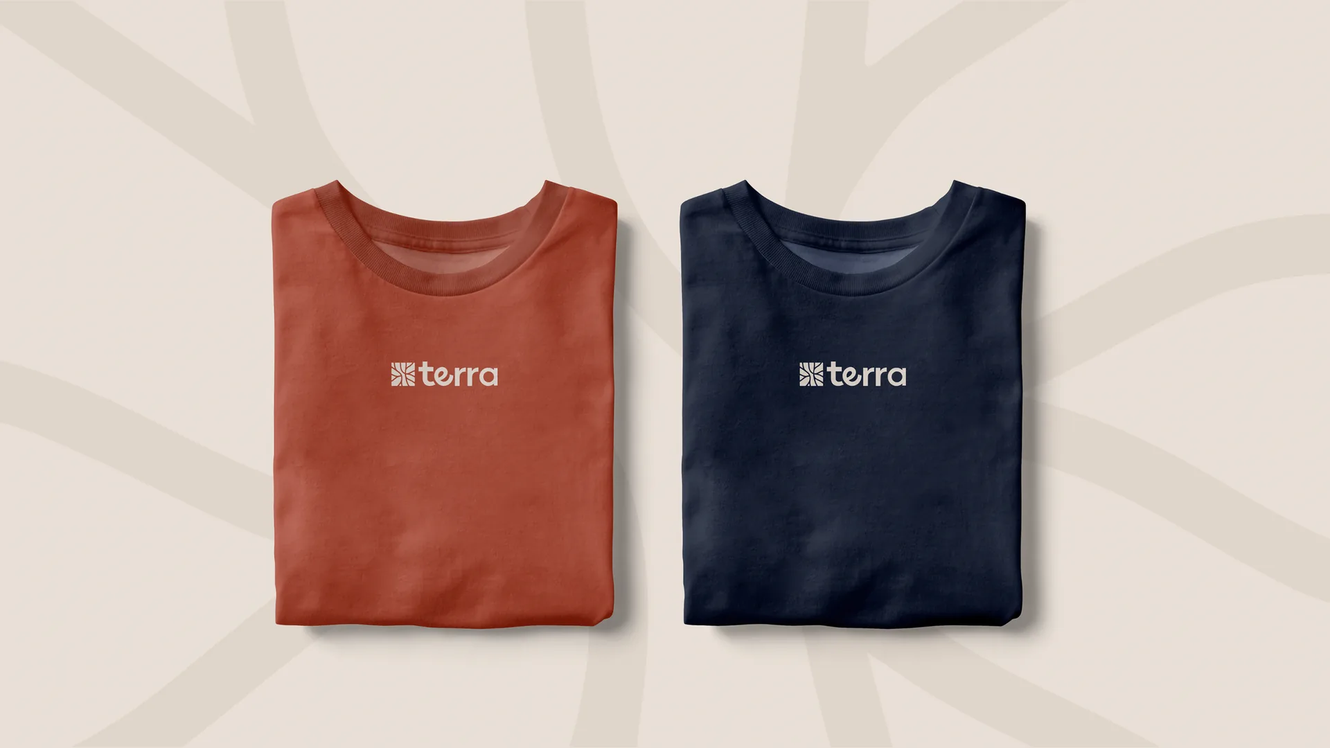
Business card, Instagram, laptop, tote and T-shirts: the symbol changes scale and color, the brand stays recognizable.
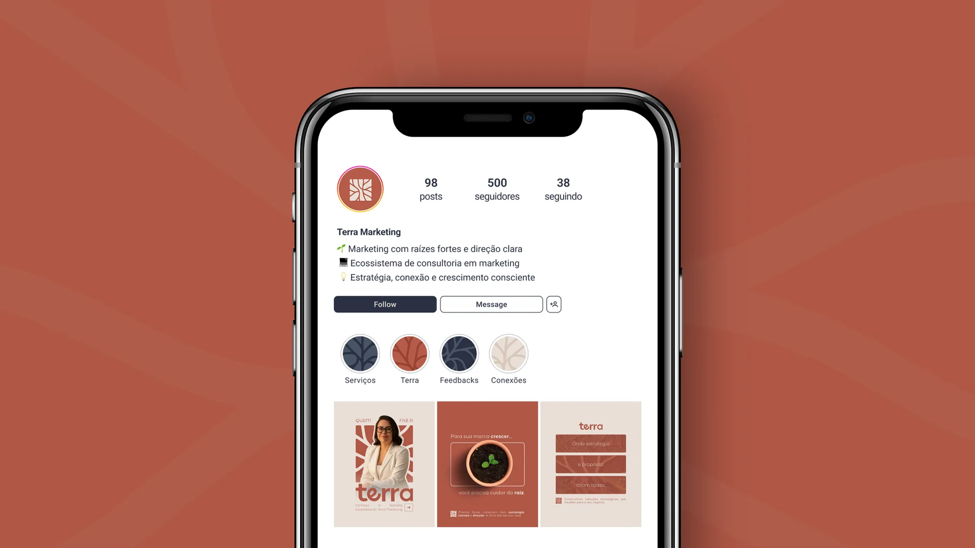
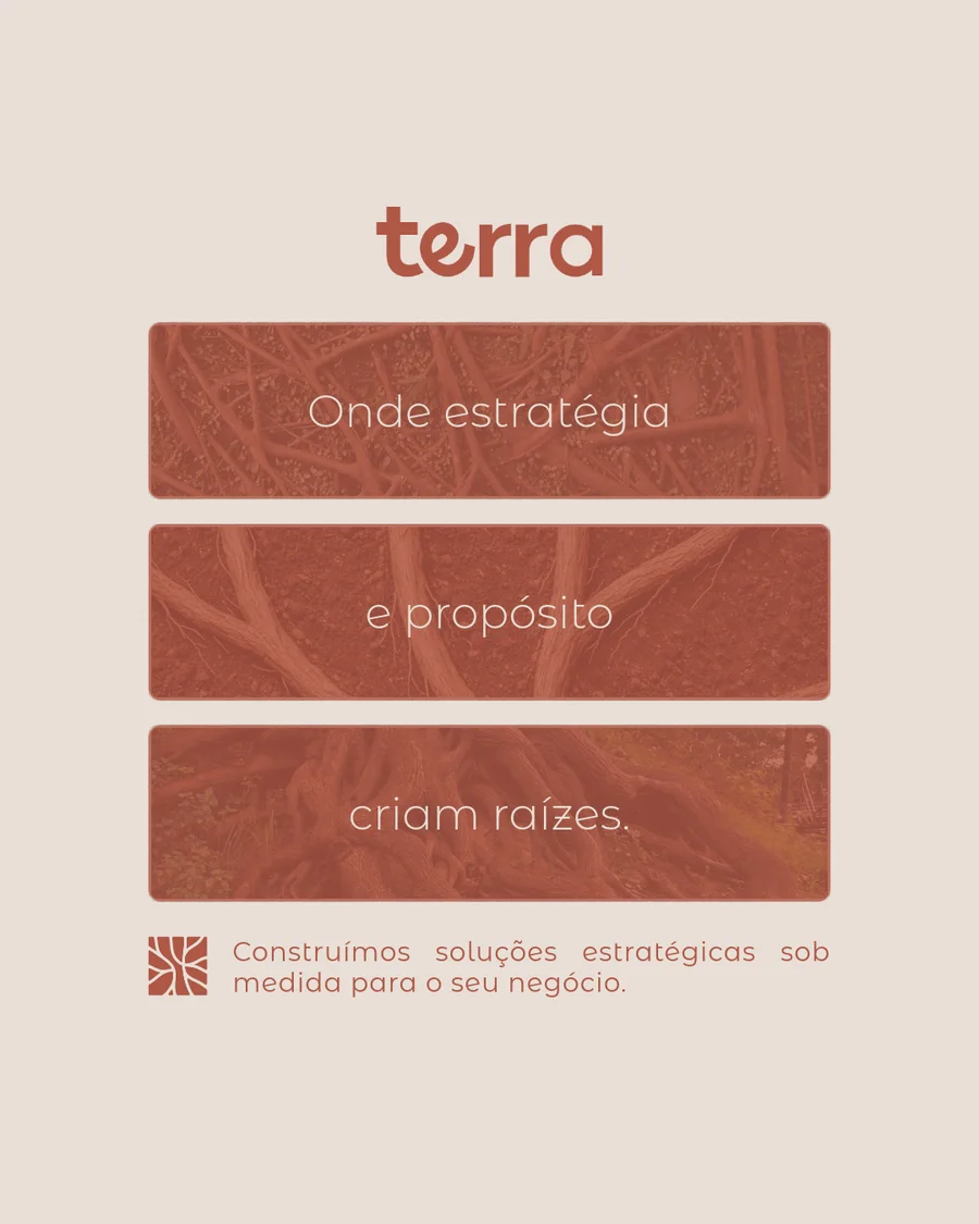
A feed that grows with the brand
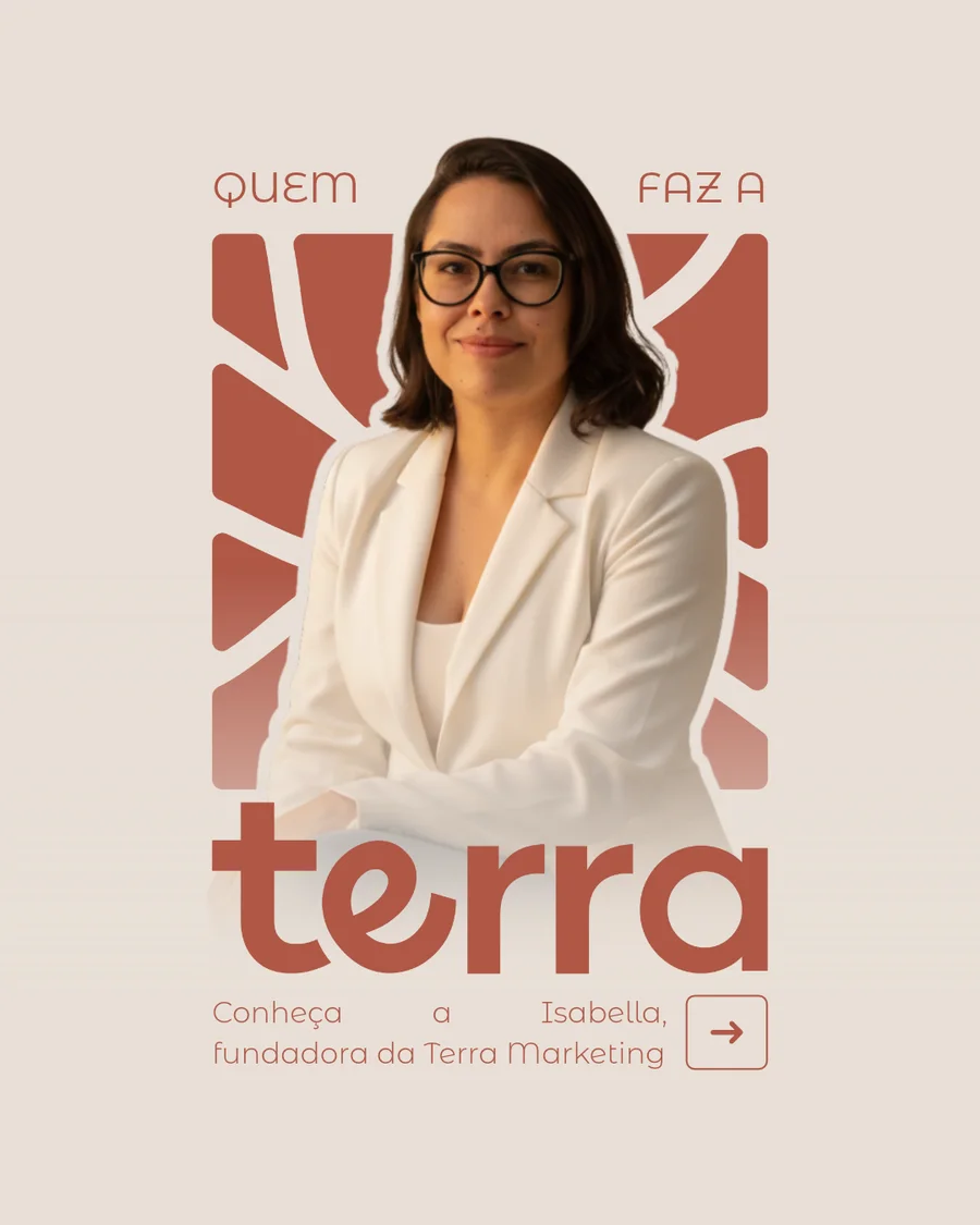
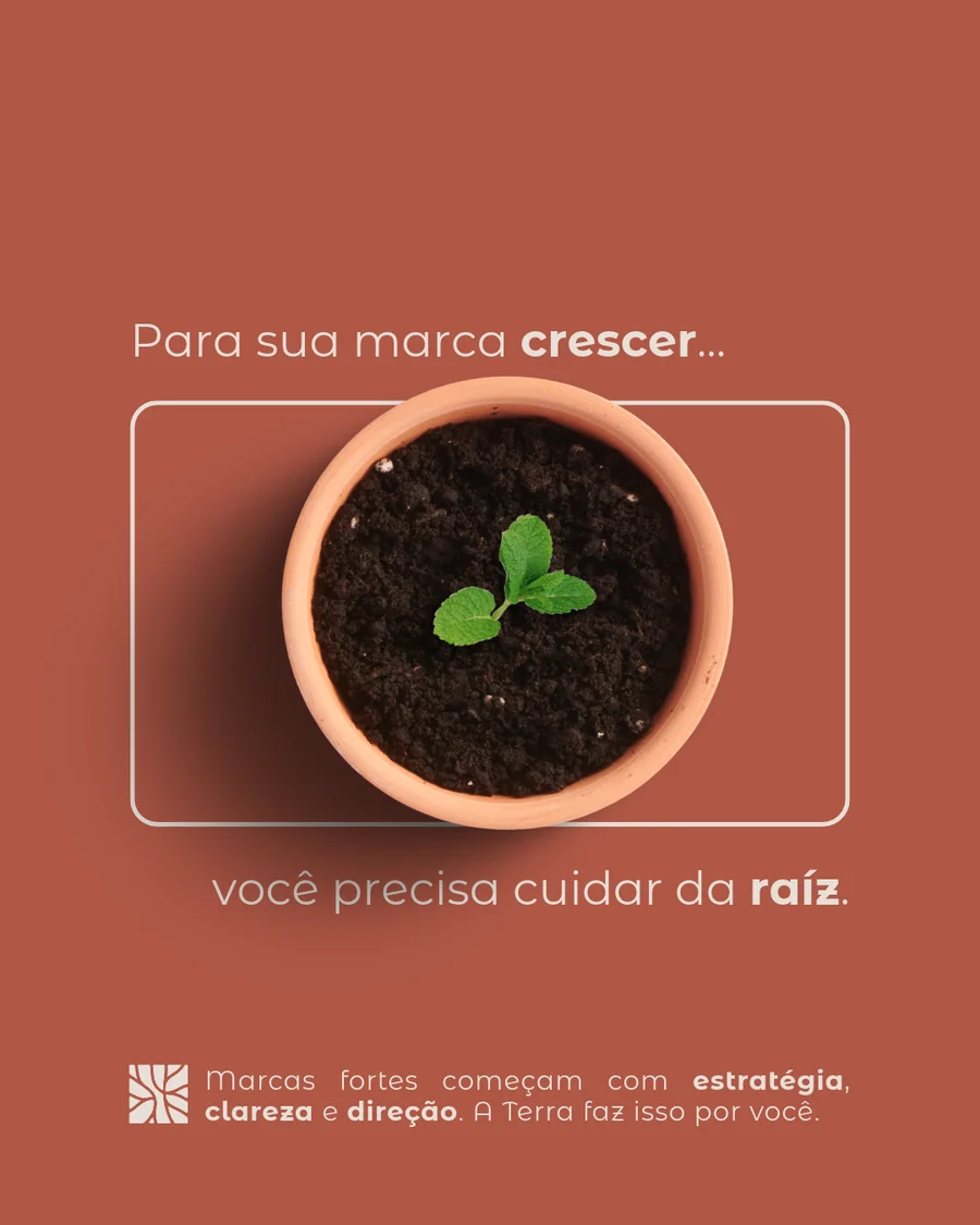
Profile, highlights and the first posts live, with the brand’s palette, symbol crops and tone of voice.
Terra Marketing
🌱 Marketing with strong roots and clear direction
💻 A marketing consultancy ecosystem
💡 Strategy, connection and conscious growth
 Services
 Terra
 Feedbacks
 Connections
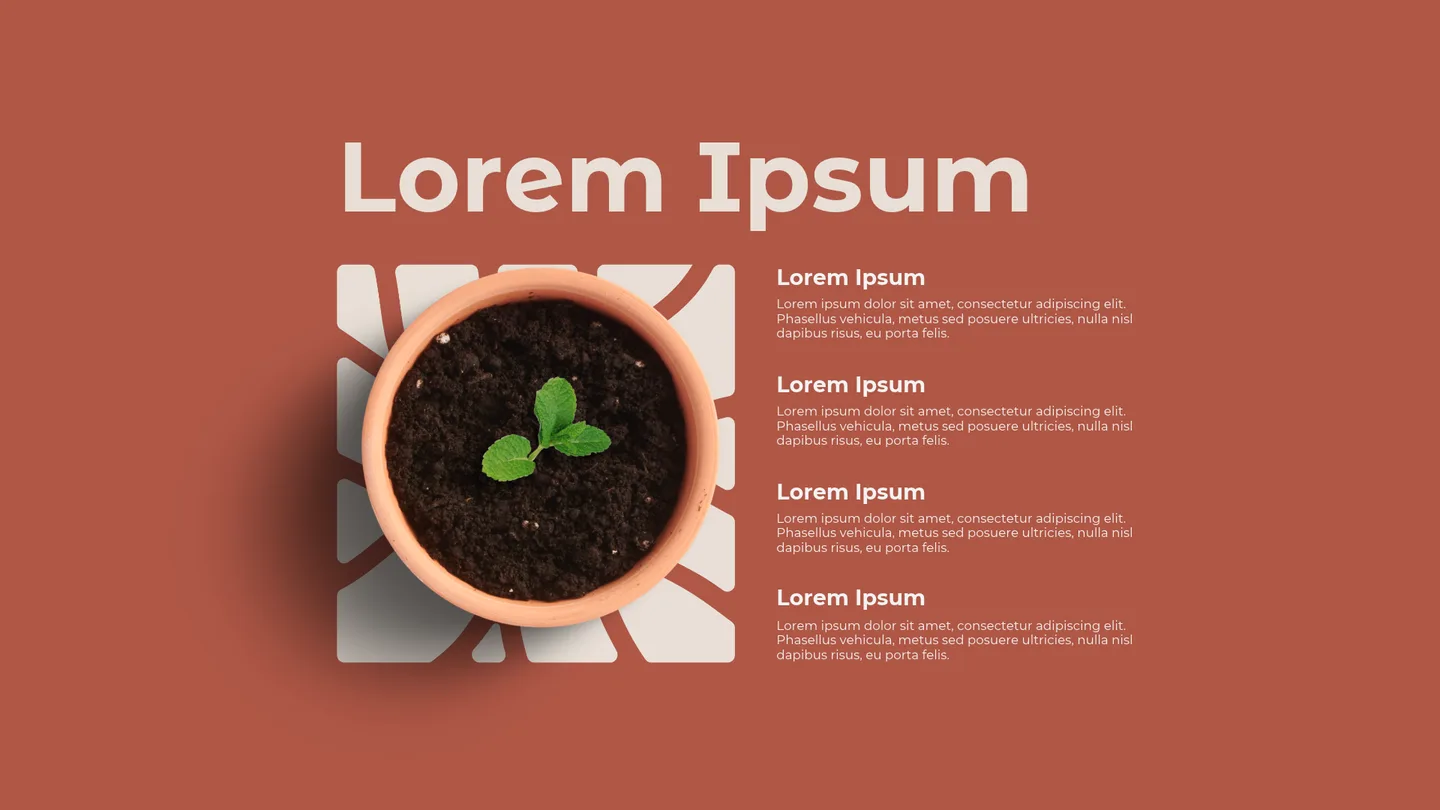
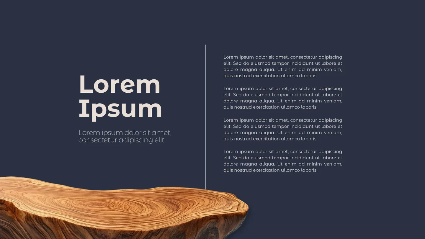
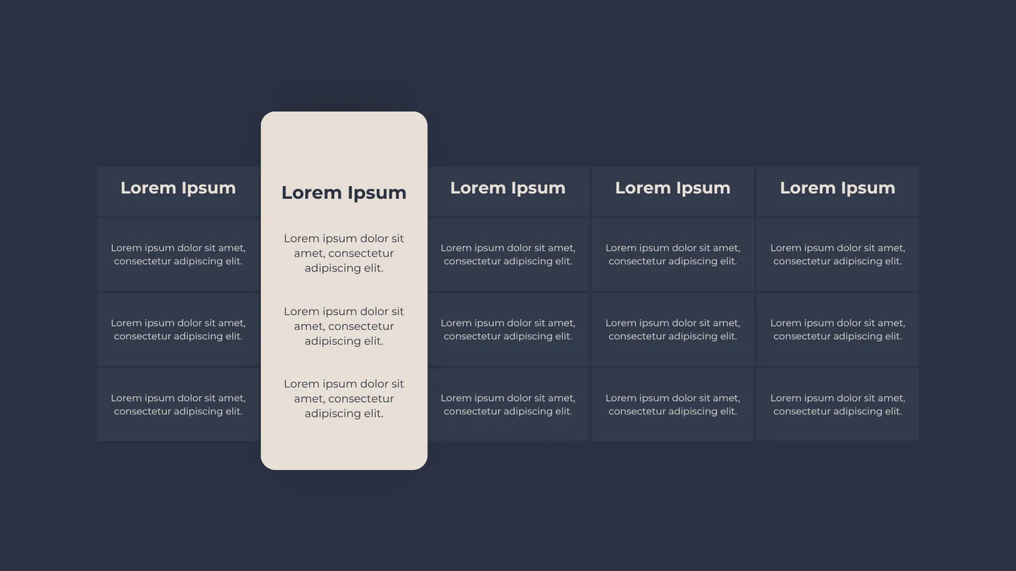
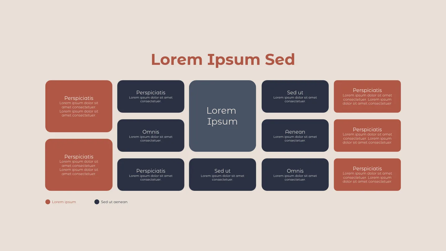
Presentations ready for every client
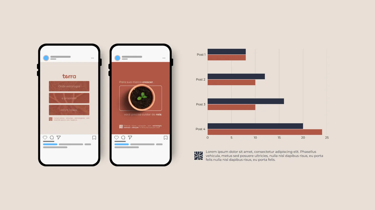
Cover, dividers, text, tables, comparisons and results. The team just swaps the content and the deck comes out on brand.
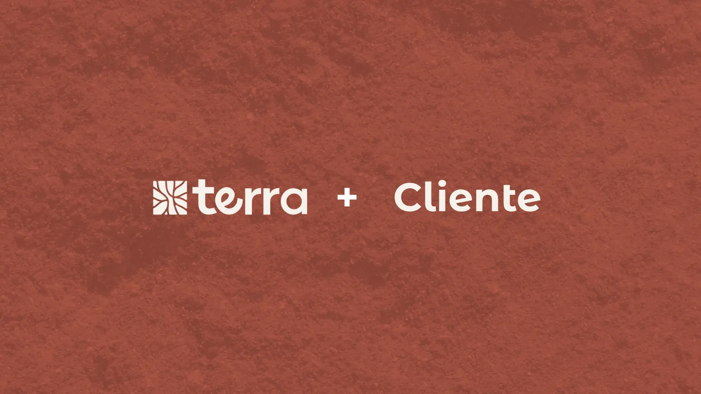
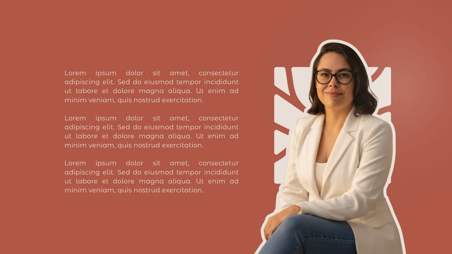
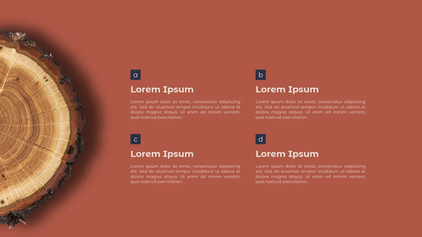
A brand that feels like its founder and is ready for the market
Terra came out of the process with an organic, original identity that tells its own story: the roots symbol translates how the consultancy works, and every color and type choice came from what the founder wanted to convey. At the same time, it is a professional brand that fits the market well and is ready to present proposals, post on social media and win clients consistently.
- Concept and essence
- Symbol
- Logotype
- Logo variations
- Palette and typography
- Image direction
- Stationery
- Instagram profile and posts
- Slide template